8th Ed. Dicey Decisions: Updated Designs in OP

Discussion in 'Lizardmen Discussion' started by Qupakoco, Apr 5, 2015.

?

Pick 4

Poll closed Apr 15, 2015.
  1. Death Mask

    21 vote(s)
    63.6%
  2. Lizard Glyph

    8 vote(s)
    24.2%
  3. Comet

    6 vote(s)
    18.2%
  4. Bob's Head

    11 vote(s)
    33.3%
  5. Artillery Pips

    14 vote(s)
    42.4%
  6. Artillery Numerals

    8 vote(s)
    24.2%
  7. D3

    19 vote(s)
    57.6%
  8. Wound Marker

    13 vote(s)
    39.4%
  9. Magic Comet

    14 vote(s)
    42.4%
  10. Snake Eye

    11 vote(s)
    33.3%
Multiple votes are allowed.
  1. pendrake
    Skink Priest

    pendrake Well-Known Member

    Messages:
    3,764
    Likes Received:
    5,023
    Trophy Points:
    113
    Tinker, tinker, tinker...

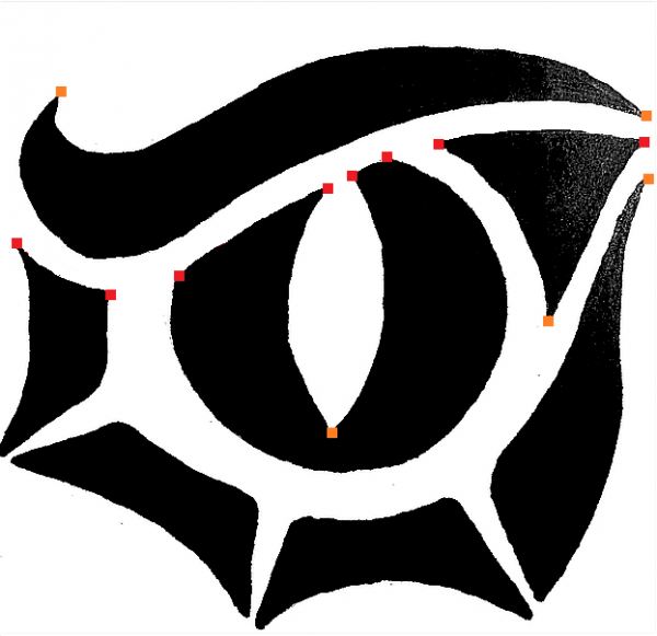
    Made some small changes (paintbrush accckk!) I tried to make the white line under the...

    LIZARD-EYE2.png
    ...eyebrow more even. Like a set distance OFFSET from the bottom edge of the eyebrow.
    There is still stuff to fix. I wish my AUTOCAD wasn't broke. The slit shaped pupil was supposed
    to look perfectly vertical (it was in my mind) but somehow it now looks canted a bit...must
    needs fix.:rolleyes:


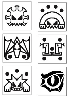
    Here it is shrunk down to something...

    LIZARD-EYE2S.png
    ...closer to dice face size.
     
  2. Qupakoco
    Skink Chief

    Qupakoco Keeper of the Dice Staff Member

    Messages:
    1,871
    Likes Received:
    1,166
    Trophy Points:
    113
    Ooh baby that's nice. Any complaints if I replace the current snake eye with this one?
     
  3. Scalenex
    Slann

    Scalenex Keeper of the Indexes Staff Member

    Messages:
    10,826
    Likes Received:
    19,277
    Trophy Points:
    113
    Yes, I have a complaint. The new snake eye is so good it makes me have slight buyers remorse for buying several of the old dice last order...

    As long as we are changing the eye, can we change the five pip die from a swarm to a Steggy? Something that gets used a lot more than Swarms
     
    Qupakoco likes this.
  4. MasterKrox
    Saurus

    MasterKrox Member

    Messages:
    50
    Likes Received:
    9
    Trophy Points:
    8
    Cant wait til we get to order. The only thing i say is no symbol on the one. No one wants to see a one so no one wants the symbol. Personally id like to see the symbol come up
     
  5. Qupakoco
    Skink Chief

    Qupakoco Keeper of the Dice Staff Member

    Messages:
    1,871
    Likes Received:
    1,166
    Trophy Points:
    113
    It's perfect for leadership checks though! Snake eyes goes along with cold blooded nicely.
     
    Overlord of Serpents likes this.
  6. pendrake
    Skink Priest

    pendrake Well-Known Member

    Messages:
    3,764
    Likes Received:
    5,023
    Trophy Points:
    113
    Not from me. It could still use @n810 's CAD, Splines, Dwarven Trickery, Graphic Cleanup treatment, sharper corners, etc.,etc.

    But,if you guys like it, toss it in there.

    Is one of the other faces of that one a Steggy symbol? n00b that I am, I havn't worked out the the glyphs on that dice.
     
    n810 likes this.
  7. n810
    Slann

    n810 First Spawning

    Messages:
    8,103
    Likes Received:
    6,522
    Trophy Points:
    113
    Smoother ?
    new eye.png
     
  8. pendrake
    Skink Priest

    pendrake Well-Known Member

    Messages:
    3,764
    Likes Received:
    5,023
    Trophy Points:
    113
    Hi, N810

    I think I liked it better with the sharp corners. Particularly at the bottom of the vertical eye slit. Also the invisible white line under the eyebrow is lost with the round corners.

    If I can art-direct a little:
    LIZARD-EYE2dots.png
    It really needs the sharp corners where I have added the orange and red dots. The red dots are all intended to be
    points on an invisible white outline of the eyebrow piece. AS if there had been an AutoCAD OFFSET line created from the eyebrow
    that defined and bounded all the pieces below. That is what really sells the eyebrow visually and sorta ties the eye together.
     
  9. n810
    Slann

    n810 First Spawning

    Messages:
    8,103
    Likes Received:
    6,522
    Trophy Points:
    113
    Yea, I was trying out a method in photoshop, where you us a heavy blur and then reduce the color palate to just 2 colors, I was trying to smooth out some of the jagged curves, well that part worked, but I loose all the pointy bits as well. when It gets shrunk to 10mm there won't be a ton of difference.

    so for my second attempt, I'll try and make the sharp one.
     
    Last edited: Apr 8, 2015
    pendrake likes this.
  10. pendrake
    Skink Priest

    pendrake Well-Known Member

    Messages:
    3,764
    Likes Received:
    5,023
    Trophy Points:
    113
    We are probably confusing the heck out of Bob with all this dwarven [CAD] gimcrackery talk...

    Holding sharp corners on fonts was always a problem for those LinoType guys, back in the day. But that was a reason to have extra sharp corners on the master drawing. Bet the same principles apply with Chessex'es foil stamping equipment.
     
  11. Scalenex
    Slann

    Scalenex Keeper of the Indexes Staff Member

    Messages:
    10,826
    Likes Received:
    19,277
    Trophy Points:
    113
    The glyphs are a stylish one pip mark. A Terradon for two, a Razordon for three, a Bastiladon for four, a Swarm for five and Kroak for six. Basically it shows you what get killed though the dice could theoreticlaly include a Ripper, Troglodon, Salamander, Stegadon, or regular Slann. Troglodons are used so seldom I wouldn't want one on the dice. A regular Slann would get confused with Kroak. Rippers kind of look ugly. Salamanders make up more of the artillery die than Razordons so Razordons got the wound marker as compensation, so only the Steggies need a promotion in my opinion.
     
    Tlaxbitza likes this.
  12. n810
    Slann

    n810 First Spawning

    Messages:
    8,103
    Likes Received:
    6,522
    Trophy Points:
    113
    sharper version

    eye-sharp-1.jpg
     
    Last edited: Apr 8, 2015
    Scalenex and pendrake like this.
  13. pendrake
    Skink Priest

    pendrake Well-Known Member

    Messages:
    3,764
    Likes Received:
    5,023
    Trophy Points:
    113
  14. Qupakoco
    Skink Chief

    Qupakoco Keeper of the Dice Staff Member

    Messages:
    1,871
    Likes Received:
    1,166
    Trophy Points:
    113
    @spawning of Bob, I fixed the image link in the tryouts thread. Good memories, haha.


    Anyone wanna take a crack at the Steggy, per @Scalenex's suggestion?


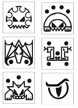
    I added the new eye into the Wound Marker die, but I'm not sure it fits as well since it's more organically shaped than the rest of the images. My thoughts are to keep the Wound Marker design the same and have a new Snake Eye die with the new design. Suggestions?

    Wound Marker NEWWWWW.jpg versus.. Wound Marker.jpg
     
    Last edited: Apr 9, 2015
  15. pendrake
    Skink Priest

    pendrake Well-Known Member

    Messages:
    3,764
    Likes Received:
    5,023
    Trophy Points:
    113
    It got awfully blocky when you shrank it. It probably does go better with the...

    Lizard Glyph
    [​IMG]
    ...when considering style. (But use it on whichever die you guys like.)

    For the wound marker what if the snake that looks like a numeral one was used on the one face?

    That would leave the field clear for the 5 face to be a more geometric and glyph-like stegadon.
     
    Qupakoco likes this.
  16. pendrake
    Skink Priest

    pendrake Well-Known Member

    Messages:
    3,764
    Likes Received:
    5,023
    Trophy Points:
    113
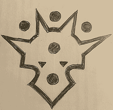
    Stegadon: five pips; glyph style; similar to other faces...

    Pencil-Steg2.png

    Two of the pips getting double-duty as horns. Triangles for eyes...
    Should legs be added?
     
  17. pendrake
    Skink Priest

    pendrake Well-Known Member

    Messages:
    3,764
    Likes Received:
    5,023
    Trophy Points:
    113
    Just a pencil at this point.
     
  18. NIGHTBRINGER
    Slann

    NIGHTBRINGER Second Spawning

    Messages:
    84,850
    Likes Received:
    267,889
    Trophy Points:
    113
    Steggy looks good!
     
  19. pendrake
    Skink Priest

    pendrake Well-Known Member

    Messages:
    3,764
    Likes Received:
    5,023
    Trophy Points:
    113
    I have added an optional leg on one side...but maybe it is more distinct from other faces without legs/feet...thoughts?
     
  20. Scalenex
    Slann

    Scalenex Keeper of the Indexes Staff Member

    Messages:
    10,826
    Likes Received:
    19,277
    Trophy Points:
    113
    Looks good, but I would tilt the eyes at the same angle all of Bob's work is at and make the horns more pronounced. Maybe go with three horns. Many Steggies have more than three horns but they are based on triceratops so that will grab people's subconscious quickly.

    Also, I think the pips should all be outside the picture, that's how the other ones work. Otherwise the pips might blend in with the Steggy picture.
     

Share This Page