-
The forum software have been upgraded to the latest version.
If you notice anything that looks off, or does not work, please let us know.
For more information, click here.
You are using an out of date browser. It may not display this or other websites correctly.
You should upgrade or use an alternative browser.
You should upgrade or use an alternative browser.
KoW Salamander Colour Schemes
- Thread starter BAE
- Start date
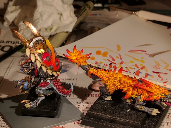
And the Clan Lord on Fire Drake:


I used a dragon from D&D attack wing, I think it was a silver dragon, and repainted it into a dark brown scheme with some fiery details. The stones on the base are mainly there to add weight and keep him stable, but they are a nice effect on their own as well, I think.


I used a dragon from D&D attack wing, I think it was a silver dragon, and repainted it into a dark brown scheme with some fiery details. The stones on the base are mainly there to add weight and keep him stable, but they are a nice effect on their own as well, I think.
Slann
Bowser
Third Spawning
- Messages
- 5,655
- Likes Received
- 8,553
- Trophy Points
- 113
This is brilliant! The rider looks amazing and the dragon is awesome! The stones look great too.And the Clan Lord on Fire Drake:


I used a dragon from D&D attack wing, I think it was a silver dragon, and repainted it into a dark brown scheme with some fiery details. The stones on the base are mainly there to add weight and keep him stable, but they are a nice effect on their own as well, I think.
Carnasaur
SlanntaClause
Well-Known Member
- Messages
- 1,210
- Likes Received
- 2,779
- Trophy Points
- 113
And that's it! 2000pts all ready for Clash of Kings next weekend. I thought I was going to have a break after doing this army but I somehow seem to have purchased a bunch of Bretonnian models to do a Brotherhood army...
View attachment 25514
that huge fire elemental thing looks like raganaros from wow - its really cool - the whole army is impressive
Here is one of my Fire Elemental hordes (that I finally got finished):

The elementals themselves are made from silicone paste. One tube cost me 35 SEK (about 3 Euros), and was enough to make two hordes of Fire Elementals. Wargaming doesn't get much cheaper than that.

The elementals themselves are made from silicone paste. One tube cost me 35 SEK (about 3 Euros), and was enough to make two hordes of Fire Elementals. Wargaming doesn't get much cheaper than that.
Scar-Veteran
tom ndege
Well-Known Member
- Messages
- 2,568
- Likes Received
- 5,173
- Trophy Points
- 113
Looks good! I use the same toy lizard for a salamander conversion...Here are a few pics of my fiery lizards:


I use Vallejo's models colors. A base of Bright orange, washed with black wash and drybrushed again with Bright orange. I then drybrush 3 layers of mixes of Bright orange and Flat yellow, increasing the amount of the latter each time.
Scar-Veteran
tom ndege
Well-Known Member
- Messages
- 2,568
- Likes Received
- 5,173
- Trophy Points
- 113
Here is one of my Fire Elemental hordes (that I finally got finished):

The elementals themselves are made from silicone paste. One tube cost me 35 SEK (about 3 Euros), and was enough to make two hordes of Fire Elementals. Wargaming doesn't get much cheaper than that.
Also great!
Razordon
BAE
Well-Known Member
- Messages
- 333
- Likes Received
- 565
- Trophy Points
- 93
Right, I've picked up a paintbrush for the first time in months to try and get some models painted for a tournament on Sunday (I've been too busy building Brotherhood!). I'm going to be running two MPs and a herald, and only had two heros on foot painted, so this guy needed to get some paint on him. He's nearly to a level I'm happy with (need to shade the grey on the shield and touch up a few bits), but I am absolutely stuck on what I should do with the last two unpainted sections: the band at the top of the shield and the loincloth. I can't think for the life of me what I should do with them - any ideas??
I already thought about a cool green like Caliban Green for the loincloth, but while it is complementary to the colours of the rest of the model I just think it would look a bit out of place - I may just settle for brown. The band at the top of the shield is the one that has really stumped me.
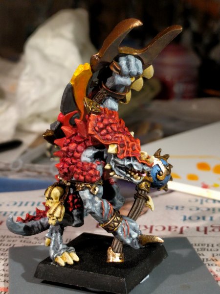
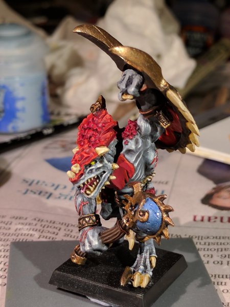
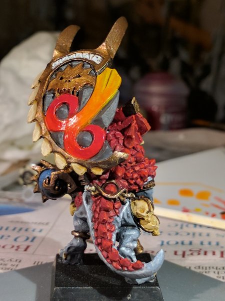
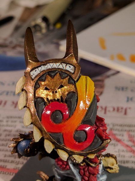
I already thought about a cool green like Caliban Green for the loincloth, but while it is complementary to the colours of the rest of the model I just think it would look a bit out of place - I may just settle for brown. The band at the top of the shield is the one that has really stumped me.


Razordon
BAE
Well-Known Member
- Messages
- 333
- Likes Received
- 565
- Trophy Points
- 93
Carnasaur
Itepixcauh
Stranded Ghekkotah
- Messages
- 1,038
- Likes Received
- 3,040
- Trophy Points
- 113
Right, I've picked up a paintbrush for the first time in months to try and get some models painted for a tournament on Sunday (I've been too busy building Brotherhood!). I'm going to be running two MPs and a herald, and only had two heros on foot painted, so this guy needed to get some paint on him. He's nearly to a level I'm happy with (need to shade the grey on the shield and touch up a few bits), but I am absolutely stuck on what I should do with the last two unpainted sections: the band at the top of the shield and the loincloth. I can't think for the life of me what I should do with them - any ideas??
I already thought about a cool green like Caliban Green for the loincloth, but while it is complementary to the colours of the rest of the model I just think it would look a bit out of place - I may just settle for brown. The band at the top of the shield is the one that has really stumped me.
View attachment 28853 View attachment 28854 View attachment 28855 View attachment 28856
Why not use the same light blue-gary from the weapon on the shield? seems logical to me. BTW nice pcinting as always!
Razordon
BAE
Well-Known Member
- Messages
- 333
- Likes Received
- 565
- Trophy Points
- 93
Why not use the same light blue-gary from the weapon on the shield? seems logical to me. BTW nice pcinting as always!
I do like this idea because it would create a repeated detail colour front and back. My concern would be that it might draw the eye away from the main design. From the front, the main eye-draw is the blue sphere on the weapon, from the rear it is the army colour motif on the shield. Also, the shield could look too 'busy' as there are already a lot of colours going on. My current thought is either grey like the rest of the shield or gold like the face on the shield, but there is still a lot of time for this to change before I go home this evening!
Carnasaur
Itepixcauh
Stranded Ghekkotah
- Messages
- 1,038
- Likes Received
- 3,040
- Trophy Points
- 113
I do like this idea because it would create a repeated detail colour front and back. My concern would be that it might draw the eye away from the main design. From the front, the main eye-draw is the blue sphere on the weapon, from the rear it is the army colour motif on the shield. Also, the shield could look too 'busy' as there are already a lot of colours going on. My current thought is either grey like the rest of the shield or gold like the face on the shield, but there is still a lot of time for this to change before I go home this evening!
That is indeed one of the problems with a limited colour palette, they look really good and I love the concept but sometimes when models are full of detail like GW likes to do it becomes hard to decide. I understand your concern with the blue, in that case I would rather go with grey as I think gold would be to plain.
Slann
Crowsfoot
Guardian of Paints
- Messages
- 8,344
- Likes Received
- 14,494
- Trophy Points
- 113
Paint the band a really dark geen and make it look like a Jade inlay, the shield design is so bright that a darker colour will keep your eye focused on the design at the moment your eys goes to the light grey as it stands out.
Incubi darkness, white brush strokes thin with some light grey ones here and there then shade with biel tan green do it patchy then glaze with waywatcher green.
Incubi darkness, white brush strokes thin with some light grey ones here and there then shade with biel tan green do it patchy then glaze with waywatcher green.
Razordon
BAE
Well-Known Member
- Messages
- 333
- Likes Received
- 565
- Trophy Points
- 93
Incubi darkness, white brush strokes thin with some light grey ones here and there then shade with biel tan green do it patchy then glaze with waywatcher green.
There are now remarkably few GW paints that I don't have and you were somehow able to select two of them.
Slann
Crowsfoot
Guardian of Paints
- Messages
- 8,344
- Likes Received
- 14,494
- Trophy Points
- 113
There are now remarkably few GW paints that I don't have and you were somehow able to select two of them.
I have a knack for that.

