Saurus
Draconder
Active Member
- Messages
- 92
- Likes Received
- 239
- Trophy Points
- 33
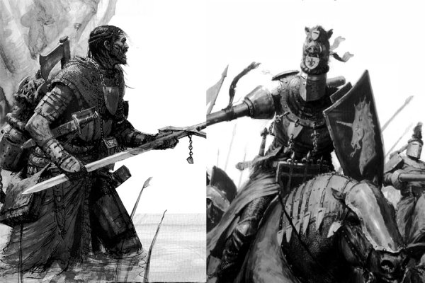
I am sure I am not the only one who might have noticed but since the launch of Age of Sigmar about three years ago and the release of the General's Handbook there has been a tonal shift in the lore and artwork of AoS.
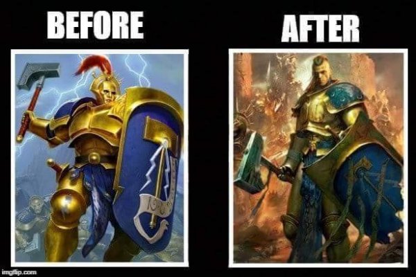
When AoS launched the artwork took a more colourful and clean appearance making it very fantastical. Lately though, the artwork has been going back to the older aesthetic of grim and dark similar to that of the old Warhammer Fantasy. Example I give below showing the shining Stormcast who's gleaming armour seemed to have dulled a little.

The lore too has taken a darker and morally grey turn. Chaos' influences are taking hold to mortal cities, Vampires are holding influential mortals as thralls and the Stormcast themselves are losing a bit of their humanity with every single reforging they go through.
So what does this mean for the Seraphon? We already got a hint of this grim aesthetic with their story in the Malign Portents with the scene showing the horrific and agonising respawning of the Seraphon:
"A chorus of shrill screams filled the air, frenzied and agonised, spilling forth from half-formed mouths. Blood stained the waters." - Dying Star
I believe that when the new battletome for Seraphon comes out we will be seeing a lot more blood while the beasts will surely look more monstrous. As a fan of the old Warhammer I find this is a welcome direction but what do you guys think?
When AoS launched the artwork took a more colourful and clean appearance making it very fantastical. Lately though, the artwork has been going back to the older aesthetic of grim and dark similar to that of the old Warhammer Fantasy. Example I give below showing the shining Stormcast who's gleaming armour seemed to have dulled a little.

The lore too has taken a darker and morally grey turn. Chaos' influences are taking hold to mortal cities, Vampires are holding influential mortals as thralls and the Stormcast themselves are losing a bit of their humanity with every single reforging they go through.
So what does this mean for the Seraphon? We already got a hint of this grim aesthetic with their story in the Malign Portents with the scene showing the horrific and agonising respawning of the Seraphon:
"A chorus of shrill screams filled the air, frenzied and agonised, spilling forth from half-formed mouths. Blood stained the waters." - Dying Star
I believe that when the new battletome for Seraphon comes out we will be seeing a lot more blood while the beasts will surely look more monstrous. As a fan of the old Warhammer I find this is a welcome direction but what do you guys think?

