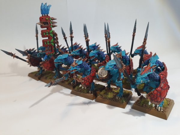
Thanks!Very Nice Man.
-
The forum software have been upgraded to the latest version.
If you notice anything that looks off, or does not work, please let us know.
For more information, click here.
You are using an out of date browser. It may not display this or other websites correctly.
You should upgrade or use an alternative browser.
You should upgrade or use an alternative browser.
Gallery Saurus Warriors
- Thread starter The Red Devil
- Start date
Temple Guard
GreenyRepublic
Well-Known Member
- Messages
- 212
- Likes Received
- 993
- Trophy Points
- 93
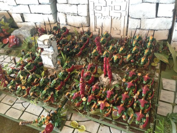
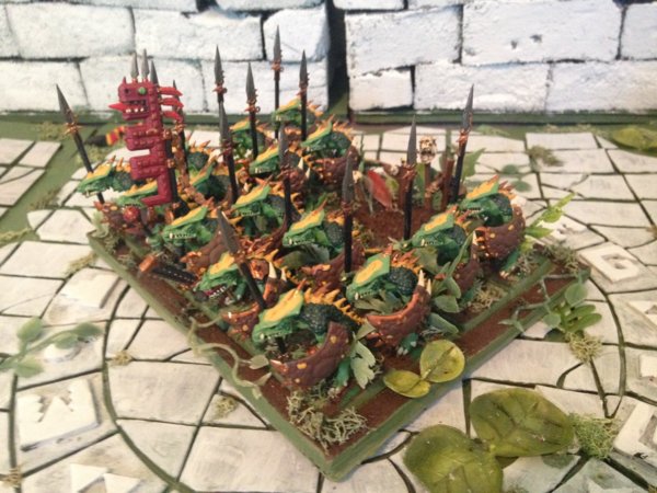
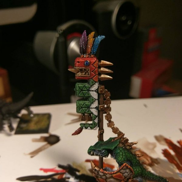
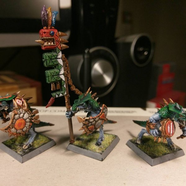
Hasn't it been a while? I didn't like the old shields on my Saurus so I tried a new colour scheme. I'm rather liking it!


Temple Guard
GreenyRepublic
Well-Known Member
- Messages
- 212
- Likes Received
- 993
- Trophy Points
- 93
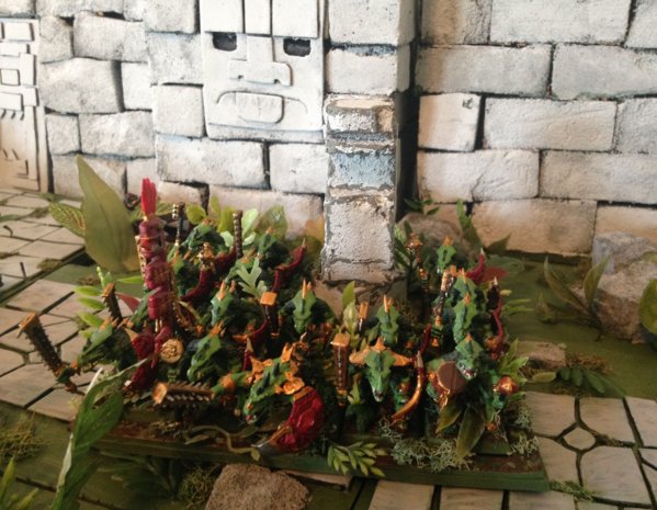
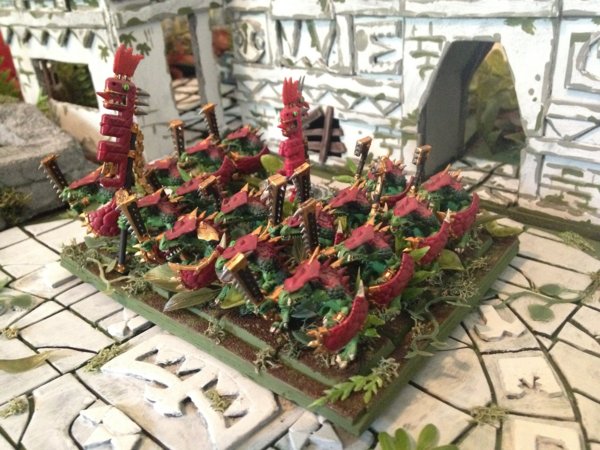
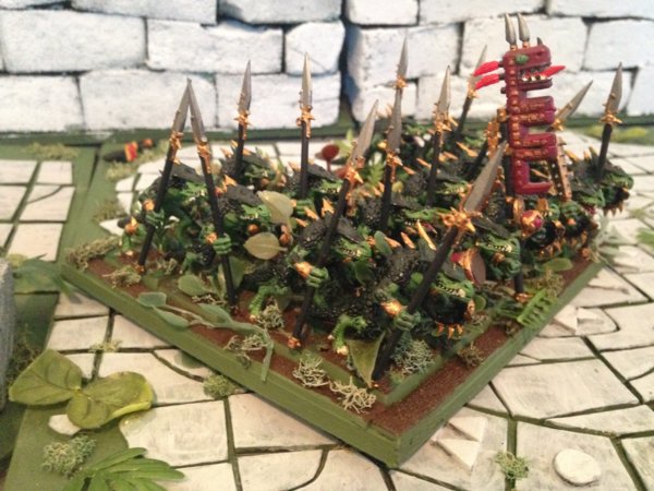
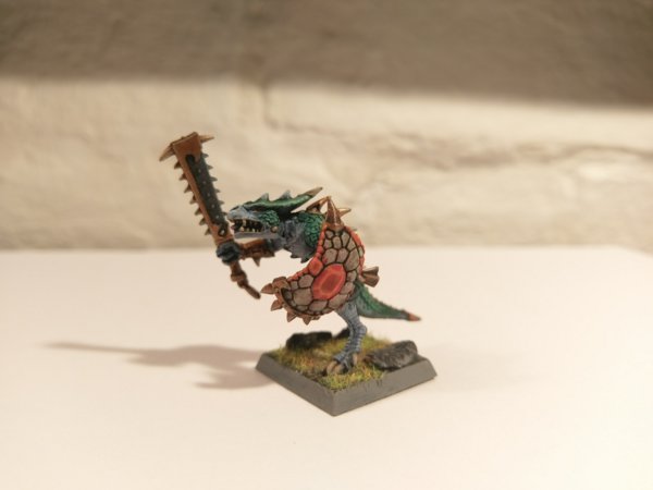
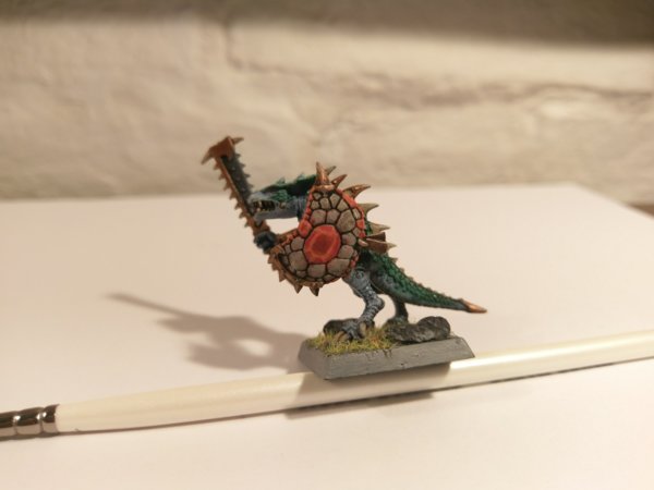
Thanks! Here are a few more shots:


Slann
Warden
Tenth Spawning
- Messages
- 6,634
- Likes Received
- 18,863
- Trophy Points
- 113
Temple Guard
GreenyRepublic
Well-Known Member
- Messages
- 212
- Likes Received
- 993
- Trophy Points
- 93
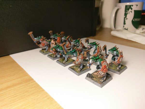
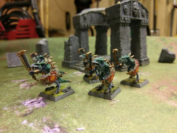
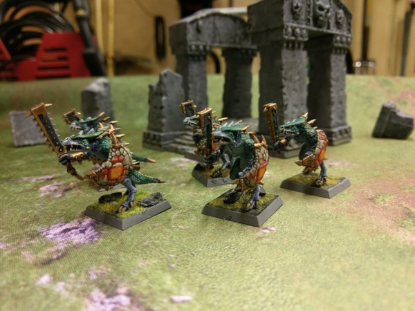
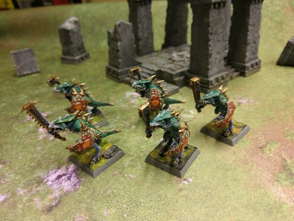
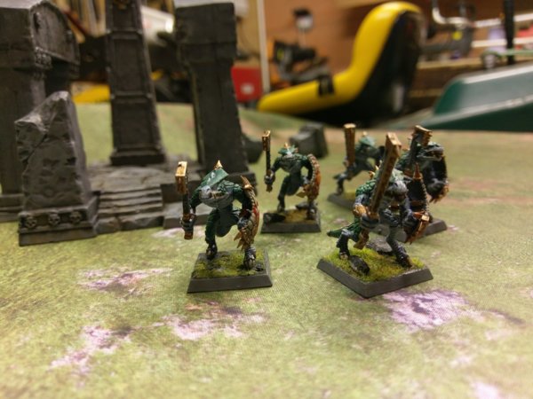
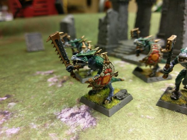
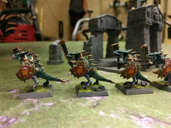
Hey again! Remember my old Saurus? I took a look and realised that their paint had been caked on thicker than icing (over 12 years of painting and I only recently figured out why thinning your paints was important, easy mistake to make right, right?), so I decided to give them a good old BioStrip Bath have another spin.
Same basic colour scheme as before (green and grey/blue) with a few adjustments. I wanted to give the shield patterns a go again (I can't stand leaving them blank) and I used Aboriginal and Aztec shield patterns as a guide, going for something that was more about creating a geometric pattern than the more European 'Sigil and Field' concept. This is what I came up with, but I'm really not sure on them just yet - something about them feels a bit off, perhaps they're too complex, or perhaps the wrong colour?
Some second opinions from the Lustrians would be welcome!


Last edited:
Carnasaur
SlanntaClause
Well-Known Member
- Messages
- 1,210
- Likes Received
- 2,779
- Trophy Points
- 113
I really like their shields designs I just started painting myself and using to much without water is a massive problem for me  but I learn now from it
Temple Guard
GreenyRepublic
Well-Known Member
- Messages
- 212
- Likes Received
- 993
- Trophy Points
- 93
I really like their shields designs I just started painting myself and using to much without water is a massive problem for mebut I learn now from it
And as you say that I think I've just figured it out. I think the issue is that the patterns, whilst on their own not too complex, when overlaid on top of the scale pattern of the basic shield's hide/scales create something that is way too noisy and confusing for the eye. I either need to make something that's dead-simple (big stripes or whatever) or follows the pattern laid out by the scale, so like colouring individual scales to create a pattern. I'm moving up to Cambridge to start an internship tomorrow so progress will be slow from here on, but I'll see if I can't bring some painting with me.
Temple Guard
GreenyRepublic
Well-Known Member
- Messages
- 212
- Likes Received
- 993
- Trophy Points
- 93
They look really good!
Coming from you Jorgik that means a massive amount, thank you kindly!
I think I'll be redoing it so that the basic idea is the same, but any individual element of the pattern is constrained to a single scale, so you don't have things crossing over the boundaries of individual scales. I'll post an update when I've given it a spin!
Slann
Crowsfoot
Guardian of Paints
- Messages
- 8,344
- Likes Received
- 14,494
- Trophy Points
- 113
And as you say that I think I've just figured it out. I think the issue is that the patterns, whilst on their own not too complex, when overlaid on top of the scale pattern of the basic shield's hide/scales create something that is way too noisy and confusing for the eye. I either need to make something that's dead-simple (big stripes or whatever) or follows the pattern laid out by the scale, so like colouring individual scales to create a pattern. I'm moving up to Cambridge to start an internship tomorrow so progress will be slow from here on, but I'll see if I can't bring some painting with me.
That's what I thought too much going on, paint over the yellow square and then highlight the red.
I really like your warriors. get rid of the yellow on the shields, tidy up the red and I think they will look amazing, good job so far
Temple Guard
GreenyRepublic
Well-Known Member
- Messages
- 212
- Likes Received
- 993
- Trophy Points
- 93
That's what I thought too much going on, paint over the yellow square and then highlight the red.
I really like your warriors. get rid of the yellow on the shields, tidy up the red and I think they will look amazing, good job so far
Thank you! I'll keep you all posted with how they get on.
Temple Guard
GreenyRepublic
Well-Known Member
- Messages
- 212
- Likes Received
- 993
- Trophy Points
- 93
Scar-Veteran
tom ndege
Well-Known Member
- Messages
- 2,568
- Likes Received
- 5,173
- Trophy Points
- 113
Much clearer. Looking more like a natural pattern now... don't know if that was your initial intention, but I like it.
The first pattern you showed us looks more like a kind of war paint... which is also cool, but I guess you should have left it all red...
The first pattern you showed us looks more like a kind of war paint... which is also cool, but I guess you should have left it all red...
Temple Guard
GreenyRepublic
Well-Known Member
- Messages
- 212
- Likes Received
- 993
- Trophy Points
- 93
Much clearer. Looking more like a natural pattern now... don't know if that was your initial intention, but I like it.
The first pattern you showed us looks more like a kind of war paint... which is also cool, but I guess you should have left it all red...
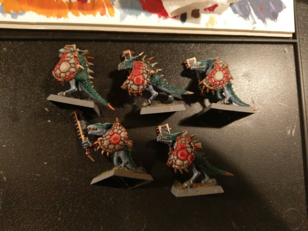
Interesting observation. I was intending for them to be war paint, but I can see how they look like natural scale patterns. In either case the objective was to try and distinguish the shields within the unit, give them some personality and flavour, so I think it's mission accomplished there.
Here's the original along with four other patterns I came up with.
Temple Guard
GreenyRepublic
Well-Known Member
- Messages
- 212
- Likes Received
- 993
- Trophy Points
- 93
Temple Guard
GreenyRepublic
Well-Known Member
- Messages
- 212
- Likes Received
- 993
- Trophy Points
- 93
Slann
Lord-Marcus
Sixth Spawning
- Messages
- 8,962
- Likes Received
- 13,938
- Trophy Points
- 113
immortal miniatures shields?
Jungle Swarm
Ryan Stanley
New Member
- Messages
- 1
- Likes Received
- 5
- Trophy Points
- 3
Slann
Killer Angel
Prophet of the Stars
- Messages
- 20,412
- Likes Received
- 41,604
- Trophy Points
- 113

