• The forum software have been upgraded to the latest version.

    If you notice anything that looks off, or does not work, please let us know.

    For more information, click here.

Greeny's Warscroll Card Redesign

Temple Guard

GreenyRepublic

Well-Known Member
Messages
212
Likes Received
993
Trophy Points
93
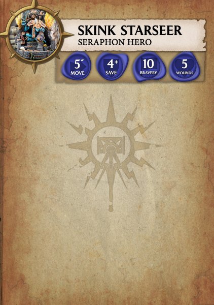
Alright I can't be bothered to write too much for this so I'll cut to the chase: The official warscroll card design is ugly, uses space badly, and is generally more difficult to reference than it really should be. I decided to take matters into my own hands:

Here are some screenshots so far, naturally it's still heavily a WIP but I have big plans.

Early layout draft/general gist:

upload_2017-9-27_23-38-14.png

And a little preview of the visual elements:

BeautyPreview.jpg

Any and all feedback/suggestions would be hugely appreciated!
 
I don't like AoS... but this definitely looks good.
 
I don't like AoS... but this definitely looks good.

When it was first released I basically swore never to touch it. Adding points helped tempt me over a bit, it's a fun game but I don't care at all for the lore.
 
Is the 12 point broken lightning symbol some kind of Sigmar symbol?

I saw the version on Imgur, Where the blank stats were overlaid on the background. Whatever that 12 point symbol is, it dehances the readability of whatever winds up on top of it. I see two solutions:
  • Ditch it (particularly if the design is not your original work)
  • Make it almost white. (Instead of being darker than the background tone make it brighter.)
I like the parchment look of the background. (Do not make it darker, whatever you do from here. Readability is 1000x more important than anything else.)

Wasted Space
The reason for the wasted space on the original warscrolls is: warmachine scrolls, big monsters, and ridden creatures.

Every scroll has room for crew ability tables, multiple combat stat lines and such whether the scroll needs those features or not. They had to design it that way to keep the font and text size identical on every scroll.
 
When it was first released I basically swore never to touch it. Adding points helped tempt me over a bit, it's a fun game but I don't care at all for the lore.
Glad you are enjoying it. It most definitely not for me, but it obviously has quite a following now. I think adding points was crucial, and the game might have crashed and burned without it.
 
Alright, made a few adjustments: That big Sigmar logo in the back has been faded a little, and I've replaced the big marble thing with something more low-key and in keeping with the theme.

I'm thinking of either one of two concepts for the core stats (Move/Save/Bravery/Wounds). I've posted previews of the two below, any preferences/opinions?


StarseerDemo.jpg

StarseerDemo2.jpg


Glad you are enjoying it. It most definitely not for me, but it obviously has quite a following now. I think adding points was crucial, and the game might have crashed and burned without it.

Yeah, there are a lot of things I'd change, and I really want to see them expand the core ruleset soon instead of delegating everything to the warscroll cards (E.g. siege weapons really need some unique rules, I think the old scatter/artillery dice would work really well with the new flexibility of unit formations). However I'd rather be playing something with my miniatures than not, and Fantasy is now a lot more difficult to get into thanks to all the books being out of print. I make the compromise of enforcing old Fantasy names and lore whenever I play. ;)
 

Attachments

  • StarseerDemo.jpg
    StarseerDemo.jpg
    2 MB · Views: 2
The blue one is better. Readability trumps all other considerations. The blue one is easier to read.

I do like the symbols choices of arrow, shield, flag, heart, for the core stats. Keep that notion.

dD_hZlKN.jpg

I had forgotten this ^ was the new Siggy symbol.

Two questions:
Why is your version of it broken and dinged in places?

Could Lizardmen Scroll cards have a Slann Mask instead of a Siggy?
 
The blue one is better. Readability trumps all other considerations. The blue one is easier to read.
I do like the symbols choices of arrow, shield, flag, heart, for the core stats. Keep that notion.

Thanks! I'm thinking of going for the second variant, but with some blue ink/whatever to try and make it a bit more eye-catching.


Two questions:
Why is your version of it broken and dinged in places?
I added some fading/weathering just for effect. ;)

Could Lizardmen Scroll cards have a Slann Mask instead of a Siggy?

Perhaps, I'm keeping the overall theme alliance-specific (Order, Chaos, Death, Destruction) as there are way too many individual factions to do a complete visual look for each. However there could be some faction-specific stuff on the flip side (if I make a flip-side).
 
Back
Top