-
The forum software have been upgraded to the latest version.
If you notice anything that looks off, or does not work, please let us know.
For more information, click here.
You are using an out of date browser. It may not display this or other websites correctly.
You should upgrade or use an alternative browser.
You should upgrade or use an alternative browser.
AoS NEW *rumor*
- Thread starter Logan8054
- Start date
Skink
DinoJon
New Member
- Messages
- 12
- Likes Received
- 22
- Trophy Points
- 3
The Seraphon were cut from the core book of the AoS RPG.
Where did you hear that? I've been to several of Cubicle 7's seminars and havent heard anything of that.... I know there not in the WHFB roleplay but they should be with the rest of the order factions in the AOS rpg.
Razordon
Acrocanth
Well-Known Member
- Messages
- 392
- Likes Received
- 1,010
- Trophy Points
- 93
Bathe your hearts in salt... https://spikeybits.com/2019/06/rumors-seraphon-lizardmen-releasing-late-summer.html
Amusingly on some site I hear complaints that if they update it will mean a big price hike So maybe you'll save money in the long run.
While great, it is also a bit of a concern for those who have only recently invested in current Seraphon miniatures.
Amusingly on some site I hear complaints that if they update it will mean a big price hike
So maybe you'll save money in the long run.
OldBlood
Erta Wanderer
Well-Known Member
- Messages
- 4,272
- Likes Received
- 9,774
- Trophy Points
- 113
despite this they feature very prominently on book covers and artGW really seems to hate Seraphon. They were mentioned about three times in the core book,(including their section about their army. In the actual lore they were completely glossed over: “oh these guys exist, now let’s go back to talking about boring humans.) and haven’t gotten a SINGLE update to stats, models etc. besides the GHB. Despite being one of the first AoS armies, many armies released after them have gotten updates. They are AWESOME and play a very significant role in the lore, and I can’t fathom why they would ignore them so much!
Skink
Monorailpig
Member
- Messages
- 29
- Likes Received
- 68
- Trophy Points
- 13
I converted warriors to guards in the SC box using spare bits
Offtopic sorry.
I dont want to seem dim, but what are temple guard? I dont see a warscroll for them
Carnasaur
ASSASSIN_NR_1
Well-Known Member
- Messages
- 1,236
- Likes Received
- 2,115
- Trophy Points
- 113
Offtopic sorry.
I dont want to seem dim, but what are temple guard? I dont see a warscroll for them
'Temple Guard' are what 'Saurus Guard' were called in Warhammer Fantasy.
Slann
Canas
Ninth Spawning
- Messages
- 7,142
- Likes Received
- 10,784
- Trophy Points
- 113
We also feature in nearly every book with lore. However, by "feature" I mean nearly every single lore book has a sentence or two going like "and there where seraphon over there who did something and thus saved the world from certain doom".despite this they feature very prominently on book covers and art
To be honest, that's one of the most confusing things about it. It's always just a throw-away line or two, but it's also nearly always a fairly important plotline hinting at the Seraphon doing these sorta things all the time to tip the balance in crucial events. And I'm fairly certain it happens in every single book that I've read. Which somehow ends up making it so that we don't ever recieve any real attention, yet at the same time are present (lore-wise) in nearly every single release antagonizing or aiding the main characters of that release from the shadows.
Chameleon Skink
Caleb ex nihilo
Well-Known Member
- Messages
- 185
- Likes Received
- 437
- Trophy Points
- 63
GW Community guy paints seraphon army for contrast example.
https://www.warhammer-community.com...seraphongw-homepage-post-3fw-homepage-post-2/
https://www.warhammer-community.com...seraphongw-homepage-post-3fw-homepage-post-2/
Slann
Aginor
Fifth Spawning
- Messages
- 12,256
- Likes Received
- 20,177
- Trophy Points
- 113
Really astonishing results!GW Community guy paints seraphon army for contrast example.
https://www.warhammer-community.com...seraphongw-homepage-post-3fw-homepage-post-2/
Saurus
zubrin
Member
- Messages
- 73
- Likes Received
- 77
- Trophy Points
- 18
Where did you hear that? I've been to several of Cubicle 7's seminars and havent heard anything of that.... I know there not in the WHFB roleplay but they should be with the rest of the order factions in the AOS rpg.
On this very forum:
http://www.lustria-online.com/threads/the-aos-rpg-devs-want-you.23019/
Temple Guard
Womboski
Well-Known Member
- Messages
- 201
- Likes Received
- 450
- Trophy Points
- 63
Miniwargamming did a carnasour in contrast paints. Looks great, but shows how the colors can bleed and blend. However that can be mitigated by being more careful or going over with the base color used to prime and then using the contrast paint again in that area.
Cold One
Dracorex
Well-Known Member
- Messages
- 115
- Likes Received
- 278
- Trophy Points
- 63
GW Community guy paints seraphon army for contrast example.
https://www.warhammer-community.com...seraphongw-homepage-post-3fw-homepage-post-2/
AWESOME! I can’t wait for these!
Miniwargamming did a carnasour in contrast paints. Looks great, but shows how the colors can bleed and blend. However that can be mitigated by being more careful or going over with the base color used to prime and then using the contrast paint again in that area.
Ripperdactyl
Acehilator
Well-Known Member
- Messages
- 456
- Likes Received
- 960
- Trophy Points
- 93
The reason why I am starting an Seraphon army, lol. Not a fan of the color selection from the GW guy, but Chris' Carno is great. The blue hues are awesome. Painting a bit more careful should almost eliminate the need to touch up and go back to the base paint, and it is propably easier to do parts like the mouth/teeth and leather with regular paints.
Skink Chief
ILKAIN
Well-Known Member
- Messages
- 1,845
- Likes Received
- 3,389
- Trophy Points
- 113
that's been confirmed to be EXACTLY THE SAME text on the Harlequins model in 40K... its even in the same order.Further solidifies my opinion in spikey bits.
2nd rummour mill picture is clearly a chest harness you can see both nipples
And 3rd one looks exactly like the text on ruins one of the dark reapers stands on.
Chameleon Skink
Caleb ex nihilo
Well-Known Member
- Messages
- 185
- Likes Received
- 437
- Trophy Points
- 63
Chameleon Skink
Caleb ex nihilo
Well-Known Member
- Messages
- 185
- Likes Received
- 437
- Trophy Points
- 63
Slann
Canas
Ninth Spawning
- Messages
- 7,142
- Likes Received
- 10,784
- Trophy Points
- 113
That colour scheme is horrific. Also, for something called "contrast" there isn't a whole lot of contrast in em. The engines on the bastiladon look good though.GW Community guy paints seraphon army for contrast example.
https://www.warhammer-community.com...seraphongw-homepage-post-3fw-homepage-post-2/
I like the layerbuilding, It makes the pattern look very easy to do. Though what he said about the yellow + blue making green makes me wonder how comfortable it'l be to use without accidently screwing up frequently. It's not that bad on the carnosaur cuz the colours mixing where the scales go to skin doesn't look too weird, but on say an armour plate it'd look weird. And correcting by applying the base again seems a tad annoying, I'd rather just apply the blue multiple times to eventually actually hide the yellow instead of creating green.
Miniwargamming did a carnasour in contrast paints. Looks great, but shows how the colors can bleed and blend. However that can be mitigated by being more careful or going over with the base color used to prime and then using the contrast paint again in that area.
Ripperdactyl
LordBaconBane
Well-Known Member
- Messages
- 475
- Likes Received
- 1,244
- Trophy Points
- 93
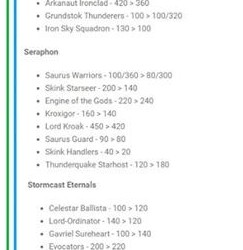
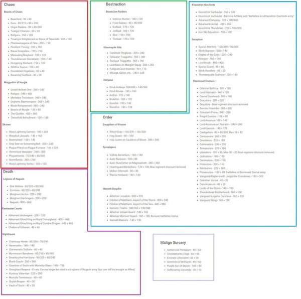
Hope, that's not true. Such a hard hit to thunderquake, but only minor drops here and there for mostly useless units, that won't make them instantly useful.
A 20 point drop to Saurus warriors is huge imo. A lot of point buffs. Although cogs getting point nerfed sucks.