I keep telling myself that I'm going to do this as well, but I keep finding more and more projects find their way to my table! And I'm not doing it! I'll have a friend ask me to paint a model up for him, or have a game coming up where I need X model, which is, of course, unpainted. (And we can't have that!) Anyway, I hear ya'. Eventually, I'll push those limits.
Yeah, gotta finish my armies first. I am slooowly working through my backlog though! Right now I have: In progress: - Scar-Veteran on Carnosaur (basecoat in progress) - Razordon (basecoated) - Mortis Engine (basecoat in progress) - Treelord (basecoat in progress) - a whole 2k points Sylvaneth army of my wife that is basically finished but needs bases. - some terrain pieces Still boxed: - Three more Terradons/Rippers - Two Stegadons/EotGs - Joseph Bugman - Knight-Incantor Planned but still in the store: - Alarielle - Nagash - Arkhan the Black - Tenenhauin
As always it’s all in practise - I still get very frustrated when something doesn’t quite look like what my head tells me it should be like, but as long as you’ve put all of your effort into it, you do well. Your models are far from poorly painted!! There are plenty I’ve secretly taken inspiration from ‘shhh’ + you have a great blog, I really like the monsterous sized ones, I spend hours just flicking through people’s (takes me ages) but I like it a lot
Thank you! It means a lot to me that people read my blog and like what they see and/or get inspired by it. That way everybody profits from it.
Haha it’s long enough after a 15hour shift ;D But yeah there are some seriously long reads lol, I feel like a stalker (hence why I don’t like everything)
I love seeing people’s weird and wonderful creations - I sit for hours pondering by next chop n change, but so often the simplest ideas skip by me, I see someone else do and I’m like ‘oh what’ I went and spent 5 hours sculpting something when I could have just popped that nice ready made plastic not there I’m well happy of just one person is inspired by anything I do, and more than happy to help quite anyone through anything I have done/or they want to do.
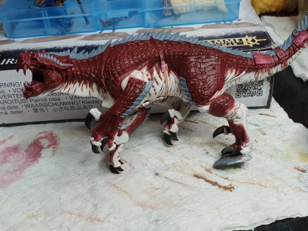
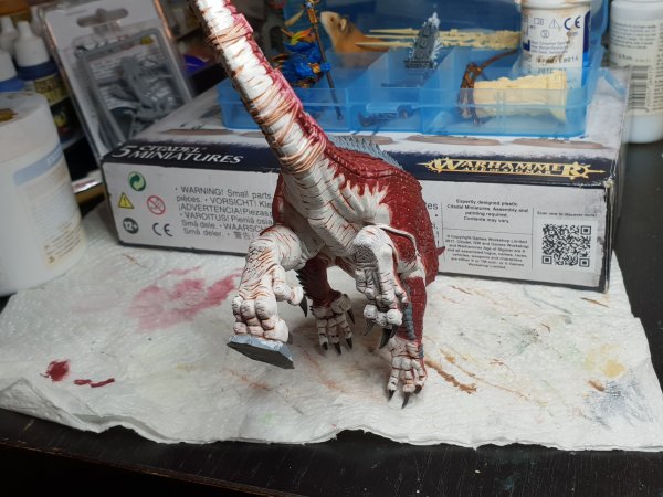
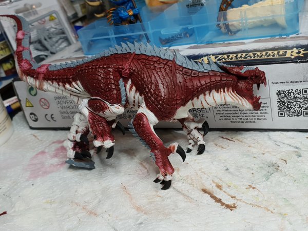
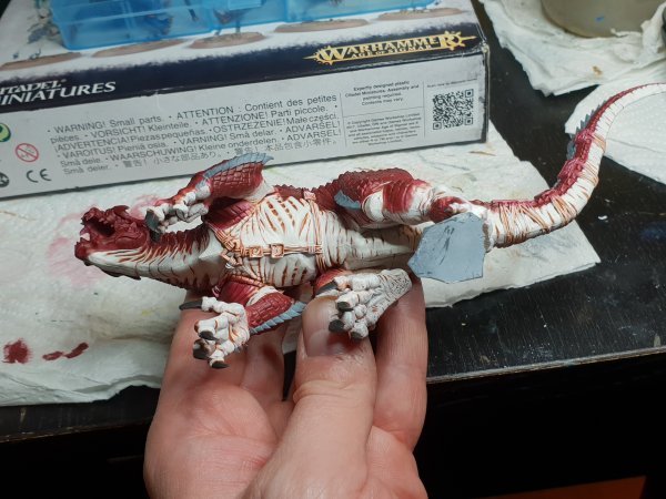
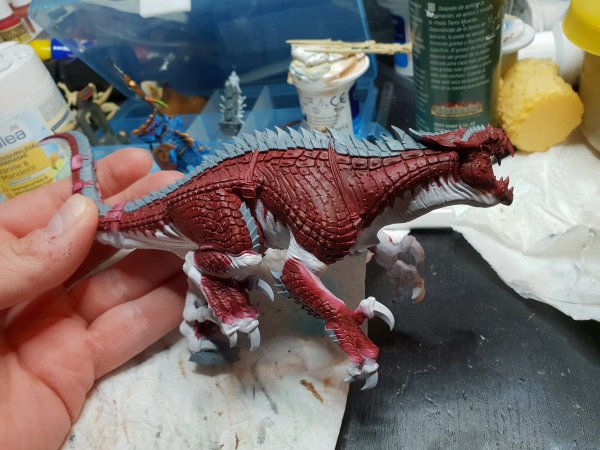
Hey y'all! I need your help. I haven't done a lot of work this week, I've been pretty busy at work. But now I want to continue my Carnosaur and I am not sure what to do. Here it is in its current state: As you can see I went for a similar paint scheme as the box, and my old Carnosaur. I managed to clean up most of the mess I caused by not being able to use an airbrush properly. The red is already shaded, the rest isn't. Next steps currently planned are these: 1. shade the grey parts dark and then drybrush them with a light grey. 2. maybe try and paint dark stripes onto the red, like on a shark or so. Maybe Tiger stripes. Or like on some fish. 3. Drybrush the red parts with a bright red to highlight the scales and give the face contrast 4. Shade the white parts 5. Paint details such as eyes, teeth, plaques, belts, and claws. Now here's what I need some input for: - should I paint the tiger stripes with a dark shade? Or really paint them on with black and use dark shade for the edges? A recipe would be nice. - should I swap #2 and #3? I fear the darkened parts will look weird if I get the bright red on them. Or will that look cool? - what about the belly? For my other Carno I used flesh tone but it was too intense, so I thinned it down with water (bad idea, became glossy and caused water marks) and it looks OK but a bit too dark. Should I use sepia or flesh tone and afterwards layer it back up to a white? I want a white-ish belly but right now it lacks depth. Maybe I should thin down the shade with airbrush thinner? That should work better and at least not cause water marks. And when shading what can I do so the little stripes painted with red don't look ugly after shading? Do you have any other ideas? I basically want the Carno to fit my old one and just look a bit better with nicer shades and highlights, and more details painted. Here is a pic of my old one's belly: And here is how my new one looks right now:
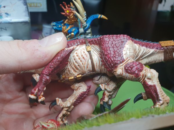
Hello there. You could always go with a grey under belly? Check my carno for an idea of what it looks like - but with red the grey/flesh colours all work fairly well - and with the stripes again black works very well indeed especially as your red is quite dark, defo highlight the raised areas to a lighter red colouring. Maybe even go darker on those top scales - potentially black themselves
For GW colours; Greys; skaven blight - shade with earth shade - highlight with stormvermin grey - thin dry brush of administration grey to raised areas such as the elbows/knees/knuckles etc - even mix 1:1 white and dry brush that over a smaller area after that for a lighter look. For the flesh I usually go for; Xv-88 - earthshade - drybrush zandri dust - then dry brush higher areas with zandri mixed with white 1:1 on raised areas as above. Black; I like using incubi darkness underneath - black over top (not completely covering the prior of course) then highlight slightly with either dark grey mixed with black or a slight colour like stegadon blue mixed with black.
How about a light grey wash? Was also thinking about suggesting pink... and even light blue... but if you want it to be a clean white (or cleaner than on the other carnosaur) layering is the way to go anyways I fear...
I think I'll go with a thinned down flesh wash after all, and then layer the raised parts back up toward white. But I still have some time, I probably won't be able to paint anything until Monday or so.
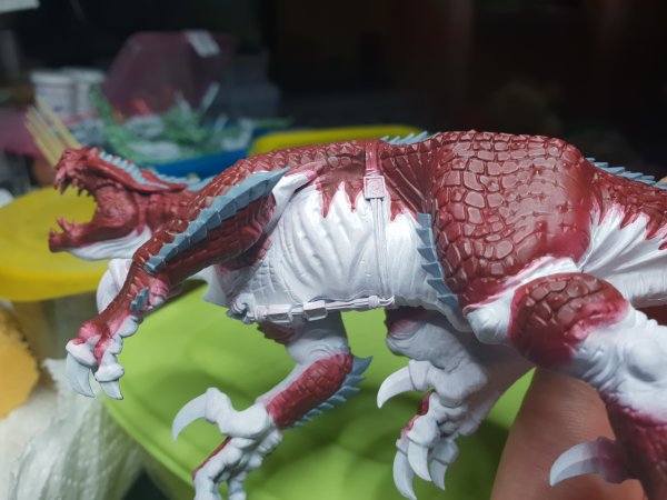
Ok here we go: I shaded all the white parts with flesh tone. After that the belly basically looked like my other Carno. By no means bad but not what I wanted. So - as planned - I took a white color (Army Painter Brainmatter Beige). A slightly yellowish tone close to but not completely white. It is the brightest non-grey color I have that is not pure white. I thinned it down and layered over all the parts except the recesses. I used several coats where necessary, and unfortunately I messed up in a few spots (mainly making the color too thick) but in most spots it looks OK. I decided against drybrushing to avoid the powdery look, and I think it was worth it although this took me three hours or so. Now it looks like this: I am.... almost happy with it I think. It does look relatively natural. My only major gripe with it is that it looks a bit...."painted" but I don't know what I did wrong there. Now I wonder: should I try and edge highlight a few spots with pure white or leave it like that? What I want to do is make the feet and hands a but more dirty with a sepia wash. I think that may work. Then the next steps will be details and the drybrush on the red parts, followed by the tiger stripes. Then shade and highlight the grey parts. What do you think?
I think, you already seem to know what you want to do but need people to give you that little extra push to do it I think it looks good - with the need of that little More that you have already planned, with that I think it will be good indeed. I like the flesh tone, more often than not I go for that drybrushed effect (it’s a safety blanket of mine) ;D but I tend to venture out with numerous different shades - take my latest Bastiladon, if you look closely from top to bottom on its shell you will see about 5 different colour shades and on top of that some extra detail colours and highlights - that’s me Experimenting within my safety net lol, if you never try you will never know
Looks good! Good thing you used the flesh color. Keeps the model more together than using grey would have. Now go on and do that damnd edge highlights! But wait at least one hour after the latest coffee... could be easily overdone with to much caffeine running through your veins...
The Carny looks really good but I wouldn't use a wash on the hands etc. What I would do is apply random lines, spots etc here and there to represent natural skin colour variation then glaze, have you got the White Dwarf where they paint the Idoneth eels, May 2018?
So true. My main problem is that I tend to overthink stuff, and that slows me down extremely. Good point. I do have a bit of a problem with shaking hands anyway, and too much coffee definitely doesn't make it better, but coffee is the fuel I run on during the day in the office. I don't have the White Dwarf (never read any WD to be honest) but I like your idea. Maybe I'll do this for the white skin: - careful pure white drybrush in some places that look very flat right now. That could give a bit of a texture - white edge highlight on some strongly protruding skin folds. - thinned down sepia shade to add some spots on the feet - use my wet mud effect color to add some dirt to the feet. Random lines are not something I am good at. Whenever I tried that it ended up looking far too regular and symmetrical. Any tips for that? And could you maybe elaborate on the glaze a bit? Not sure what you mean. I frankly wouldn't know what kind of glaze to use as I only used GW blue, yellow and green glazes up to this point (and the self-made white glaze to brighten up recessed for a glowing effect, but that's not what I want here).
Use a red glaze but thin it alot you want an opaque wash just to very slightly tint the skin, use bloodletter glaze and go 10 part medium, 1 part glaze, apply it around the edges and onto the scales a bit, on the hands and feet, might need a couple of coats. Get that WD and there is another with a Eavy metal masterclass on animal markings, if I remember I will scan and upload.