Man, Adoniz has some nice chompers. n810 had some nice ideas. The colors were good too. I agree though that the Aztec numbers could easily be confused, but the fire was a pretty simple yet explainable idea. Just went through the original dice thread and came across this gem: SoB (hehe), you have given quite a bit of graphite to the forum already. I think we can come up with a sweet kitbash with what you've provided. Just keep in mind that the image has to be pretty clean and simple since it'll go on a die. As to the questions Posed by Bob; 1. Serious 2. Geometric 3. Regular numbers 4. I just lost Quetza to the Skaven in my campaign. It was a tough fight that had the deciding factor in turn 6's close combat phase. We should hurt them.
You're not still sore about what I said about you, Lord Liquitung and Master of the Twenty-Two, Kraxullz are you ? At the time I did that post I didn't realize that you had real friends
I liked the skink w/ spear in different positions for the numbers best for the artillery. The only one that wasn't clear was the misfire, which maybe a skink shrugging or getting chomped as per the salamander die works best. As much character as we can throw on the die the better.
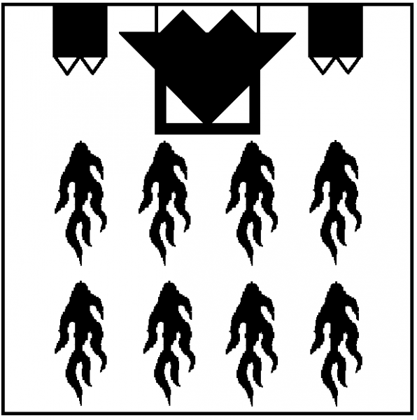
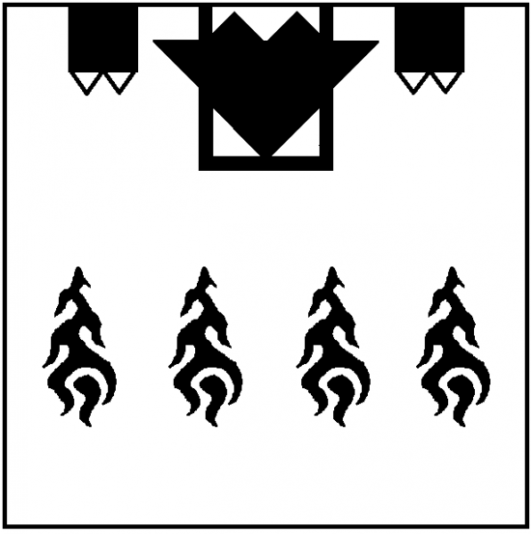
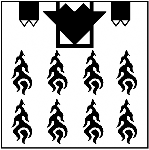
What do you guys think of getting either 20mm or 22mm size dice for these, rather than the 16mm's we got for the regular dice? You'll be able to pick them out of the bunch quicker, and it'll give us more room for drawing detail. Probably a little more expensive, but as we'll only be getting like 2 or 3 each, it'll actually be the postage that hurts us, rather than the dice cost. For the flame design, what about something like this (MSPaint ): It doesn't look as good, but it is simple, and easily identifiable. Sorry to wreck your beautiful drawing Bob, hope you don't mind the pixel horror
Those flames look awesome (and clear) I would do them the other way around (fanning out) what do you think ? SoB (hehe)
Why would I need real friends? My Lizardmen models keep me plenty of company. Cold, unforgiving, plastic company. Those look pretty good, Old Mossy. I think we're on the right track. And yes, I believe these dice should be bigger than the other ones we ordered. The GW supplied artillery dice are bigger. Not sure of the dimensions, but they seem to be a good size. Anyone got one handy to measure?
I agree, it looks quite good with the flames pointing this direction. I'd also be a fan of larger dice. We don't need a lot of these dice so they might as well be big. I agree. 1. Serious with a touch of whimsy for the misfire side of the dice. Getting eaten by the weapon of war you are trying to control is a little funny. 2. I like both Geometric and Organic styles equally (it's a steak or strawberries question). I think Geometric would probably be easier for an artist to do. 3. I prefer numerals, but the flames and spikes aren't bad. I really don't like the Mayan tick marks for dice (though they would be interesting for terrain details). 4. Skaven should get hurt. I think Slann would actually prefer if humans, elves, and dwarfs and the like attack the Forces of Destruction. Also, of all the current army books, Skaven is one of two I haven't read yet.
Lots of fluff re: skaven and the lizardmen. I think a dead rat would be much preferred by the followers of Sotek.
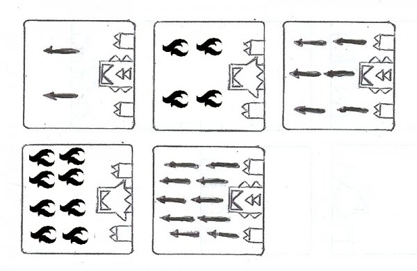
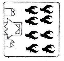
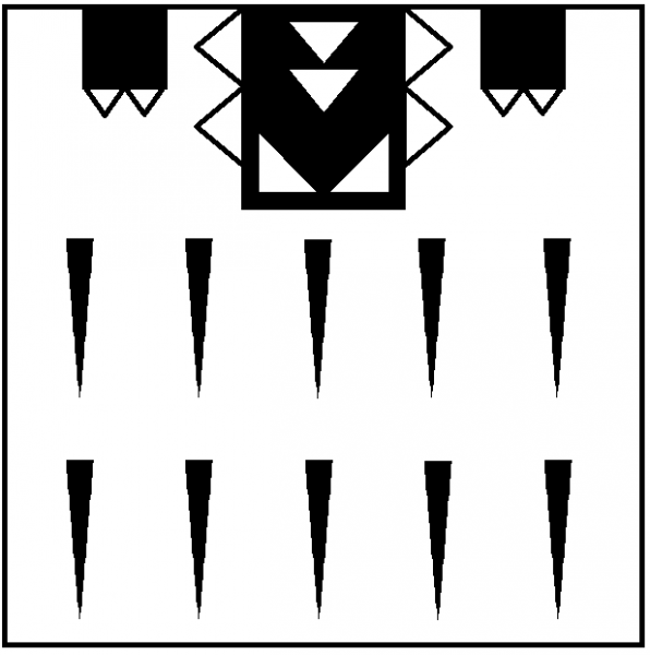
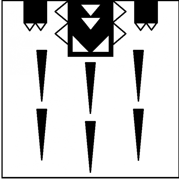
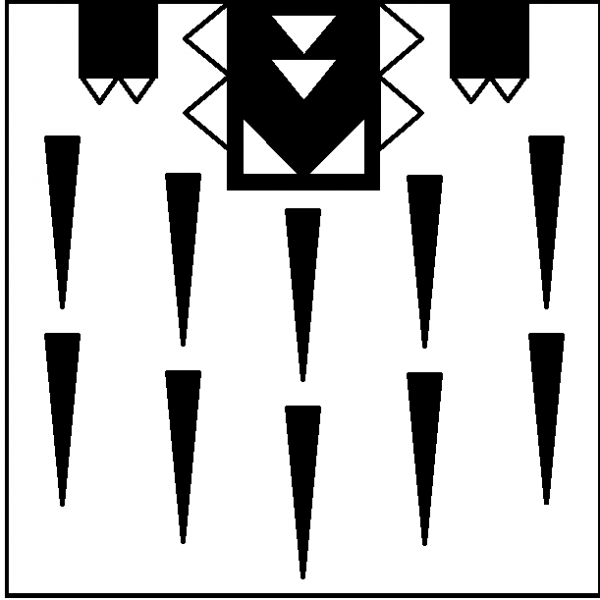
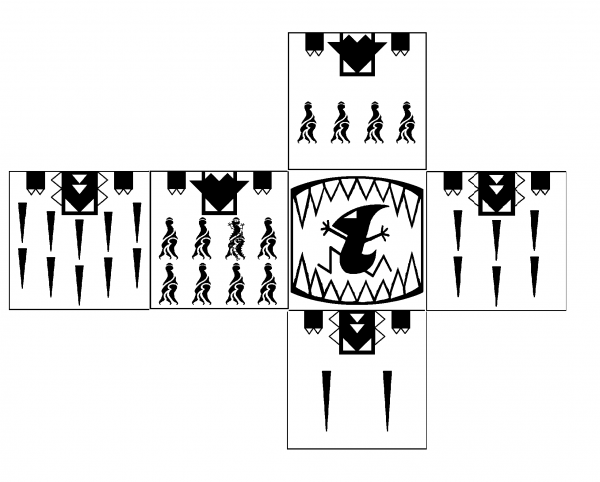
I may have done myself irreparable harm drawing all of these straight lines, and it has taken me all night but: I'm happy with the heads and legs. I did the busiest sides and see that I can do the flames fatter and more spaced, and the spines longer and wider (with the same acuity) Your comments please. options worth discussing include: 1. chevron / double chevron vs 2 straight rows (I think chevron harder to count up) 2. same scale of spines and flames on all 5 sides vs scaling them up on sides with the space 3. should I keep working on dice vs go back to shredding the remaining dignity of the mighty Lizardmen I'll sacrifice the rest on the vision in my left eye (and several skinks) to knock out 2 options for the misfire side (teeth with skink running / teeth with skink waving arms in panic)
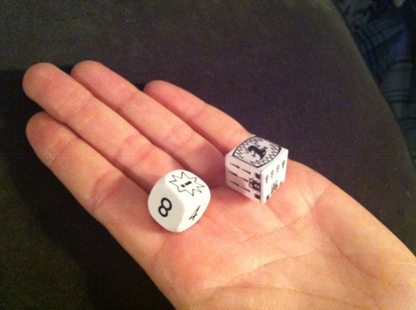
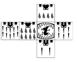
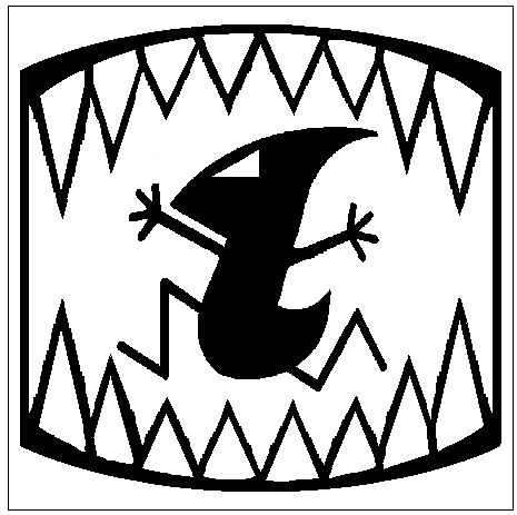
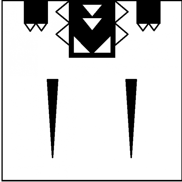
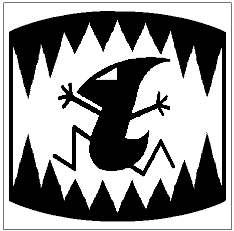
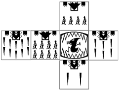
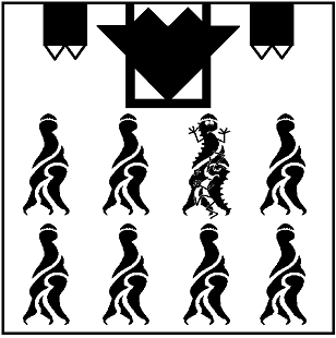
The next iteration: I did a mockup out of paper pictured here with a large GW dice. I know which I'd prefer. It even rolls about the same (misfire 4 out of 12). This is the life size mockup. It has lost a lot of res in reducing on MS paint. I think a commercial graphics program would do better. Each of the sides: I spent half the day making that template shaped flame, but reduced it looks like a little Christmas tree. I didn't really like the last one either. Anyone got a better small flame I can base it off ? I tried the little guy in a few poses. This was the squattest one, which means it fits the frame best. I prefer the white teeth to black: I think I prefer chevron rows of spines. Does it look better than straight rows? I just looked at Qupakoco's original post of the Skaven dice and can see the out of bounds areas at the corners. I think these images might just squeeze in. I suppose the manufacturer has a template, which I can wrangle these into once we settle on final designs. Tweaks anyone? (Please, I'm keen to put this to bed - means I can get to bed too!)
I would pay for a set of dice as you have them now. Since you asked for a tweak, I would suggest making the Skink's arms and legs a shade thicker. That will keep it nice and simple but make it a little less stick-figure-y. Particularly since the final picture will be fairly small. I would prefer to pay extra for extra large dice. We need to roll a maximum of three dice at once, so they might as well be as large as practical limitations allow to let people see the lovely artwork.
Very cool stuff Bob. I think the skink getting eaten is just awesome. The graphic at least. Misfires are not so fun
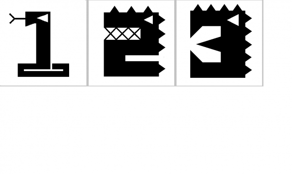
Apologies to n810 for not acknowledging his "always strikes first" again. Are we sure he is a lizardman? Did some work on the flames and am now happy. They still don't look flamey, but they have subliminal Bob and Joe. Look Closer. Look closer still....... I addition, while having strange cubic dreams, it occurred to me that the the scatter die issue could be combined with those occasional pesky D3 rolls. Make a dice with 2 of each of the following: Scatter direction given by eyeline. If a "hit" is required, you can agree with opponent that ones (or threes) are a hit. Or you can wait and see what you roll first and then say ones (or threes) are a hit. And now I've got me a three sided dice. Math no longer required! University education wasted!
Great Idea with the D3 die. I would buy a set of those for sure. I like the design you came up with for the artillary die as well.
Oh, I have some D3 dice... (Basicly they are D6's with 1 2 3 on them twice.) Ps. I find the ASF sword helps bob.
Love the D3 font you came up with there, which begs the question, might not it be better to use said font for the 2, 4, 6, 8 and 10 on the Artillery/misfire dice? It would be a whole lot cleaner looking. Fitting the 10 might be hard, but I bet you'll figure something out - I have faith in Bob!
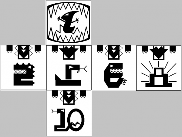
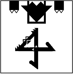
T'hinker'er, you're killing me. Fortunately Bob has a ward save..... I t'hink I'm out of concepts now. Given T'hinker'er, Scalenex, and Newscales have a preference for numerals here you go. Fitting Bob in the 10 was harder I've retained the warbeasts for interest and to improve their scatter dice utility, but they could easily be trimmed out if you want boring numbers. If anyone can think of a better idea for the 4 let me know. (I did do a holiday special edition numeral 4 just for Scalenex) Beware the Chaos Bunny! Old Mossy and I seem to prefer the spine and flame symbol idea: And I've re-scaled (get it?) the snake on the scatter / D3: More tweak suggestions are still welcome (but will become progressively less welcome after about a week)