-
The forum software have been upgraded to the latest version.
If you notice anything that looks off, or does not work, please let us know.
For more information, click here.
You are using an out of date browser. It may not display this or other websites correctly.
You should upgrade or use an alternative browser.
You should upgrade or use an alternative browser.
8th Ed. Dicey Decisions: Updated Designs in OP
- Thread starter Qupakoco
- Start date
Skink Priest
pendrake
Well-Known Member
- Messages
- 3,764
- Likes Received
- 5,025
- Trophy Points
- 113
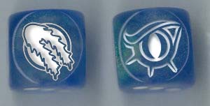
I did later wonder if there was some magic to the specific shape of the eye triangles. What says. @spawning of Bob ?Looks good, but I would tilt the eyes at the same angle all of Bob's work is at and make the horns more pronounced. Maybe go with three horns. Many Steggies have more than three horns but they are based on triceratops so that will grab people's subconscious quickly.
Also, I think the pips should all be outside the picture, that's how the other ones work. Otherwise the pips might blend in with the Steggy picture.
Having an odd number of horns on the frill creates a problem placing the pips, if there are an odd number of pips to arrange.
New steggy has no frill horns, but a big central notch in the frill.
Old steggy had frill horns.
I will ponder all this. Maybe Bob will be inspired by some of this...
It was kinda the point to let some of the pips do dual duty as horns seen nose-on.
Still, nobody has a yea or nay on adding legs?
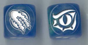
I concur with this....yea, I think Pen's Eye glyph would look best opposite the Lizardmen glyph,
as the #1 and #6 sides respectively in a dice with only 2 custom sides.
Slann
Scalenex
Keeper of the Indexes
- Messages
- 11,511
- Likes Received
- 20,465
- Trophy Points
- 113
Bob is on his family vacation and he will not be logging on to the site for about a week or so.
I don't know if there was a magic reason for his eyes, but I just want them to match. We could change the eyes on the all the original to match yours and I'd be okay with it, but it's easier to change one than 4 or 5.
I am indifferent to legs.
Since the LM Glyph and the eye only look vaguely like the number in question they represent, I imagine a two glyph die with four numbers would mildly bother some opponents, but don't let me talk you out if the majority likes it since I have so many dice from the first order, my order was going to be pretty small this cycle.
Skink Priest
pendrake
Well-Known Member
- Messages
- 3,764
- Likes Received
- 5,025
- Trophy Points
- 113
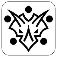
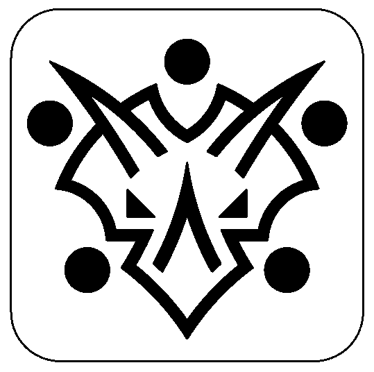
Steggy face - Take 2
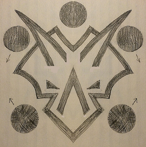
OK, this one has triangle eyes that are flat on the botttom and outboard edge,
no feet or legs, five pips around the outside, three horns, notch in the frill...
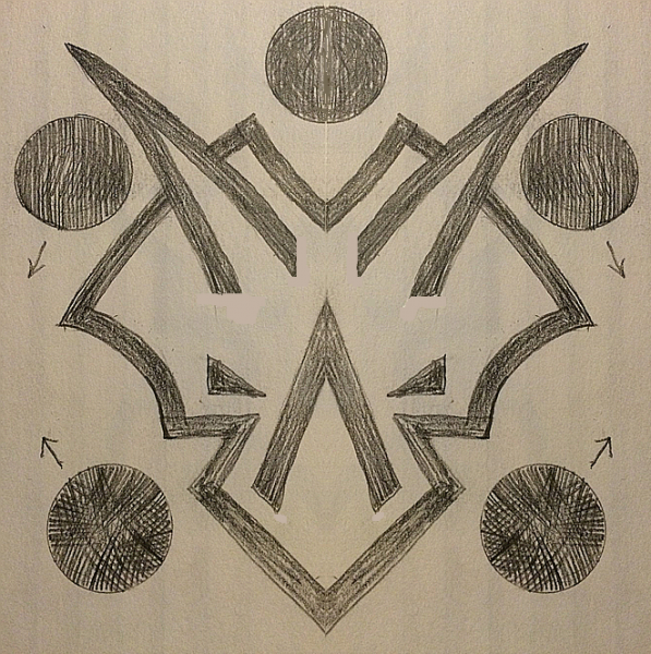
The little arrows 'next the pips are visual notes to maybe nudge their positions slightly. To better
align them with the nearest feature of the Steg Face. Maybe the pips are too big, I traced around
a dime to get even circles.
Why can't I get the first one to display next to the second one?

Both side-by-side...


OK, this one has triangle eyes that are flat on the botttom and outboard edge,
no feet or legs, five pips around the outside, three horns, notch in the frill...

The little arrows 'next the pips are visual notes to maybe nudge their positions slightly. To better
align them with the nearest feature of the Steg Face. Maybe the pips are too big, I traced around
a dime to get even circles.
Both side-by-side...

Last edited:
Skink Chief
Qupakoco
Keeper of the Dice
- Messages
- 1,871
- Likes Received
- 1,166
- Trophy Points
- 113
Hmm, probably because the images are too big? The new interface is a little different than our old one.Why can't I get the first one to display next to the second one?
That drawing looks really good though! Definitely a thumbs up from me.
Skink Priest
pendrake
Well-Known Member
- Messages
- 3,764
- Likes Received
- 5,025
- Trophy Points
- 113
Thanks.Hmm, probably because the images are too big? The new interface is a little different than our old one.Why can't I get the first one to display next to the second one?
That drawing looks really good though! Definitely a thumbs up from me.
I got it to work [display both]. I had to use the other type of image tag. Not sure why that fixed it.
Slann
NIGHTBRINGER
Second Spawning
- Messages
- 90,598
- Likes Received
- 278,523
- Trophy Points
- 113
Wow... looks good!
Skink Priest
pendrake
Well-Known Member
- Messages
- 3,764
- Likes Received
- 5,025
- Trophy Points
- 113
Thanks.I have no qualms with design replacing the current one. Great job @pendrake !
I tinkered a bit more. The horns bothered me a little. I decided they were too close to the notch. And they just sorta ended at the bottom. So I made adjustments...the upper horns bottom out on an arc and that helps imply a face...

I used golden yellow for this version.

I have no idea if the pips are the right size. They need to be the same size [?] as the other faces
I would think. I eye-balled the size of them. That probably needs to be checked and fixed on
the finalized art. Who do I send the (vector) source file to?
Scar-Veteran
spawning of Bob
Well-Known Member
- Messages
- 2,911
- Likes Received
- 5,630
- Trophy Points
- 113
I put steggy alongside the others - he looks very much at home!

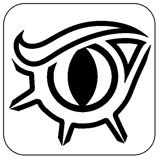
But I think the snake eye is too bold in this company - it is so much meatier than the 6.
Here it is after a the wasting sickness and a shrink ray (Thanks @ ravenss for loaning me some technology!)

I think it more plausibly says "one" now. What do you think? Worth a cleaned up version @n810?

But I think the snake eye is too bold in this company - it is so much meatier than the 6.
Here it is after a the wasting sickness and a shrink ray (Thanks @ ravenss for loaning me some technology!)

I think it more plausibly says "one" now. What do you think? Worth a cleaned up version @n810?
Skink Priest
pendrake
Well-Known Member
- Messages
- 3,764
- Likes Received
- 5,025
- Trophy Points
- 113
I put steggy alongside the others - he looks very much at home!

But I think the snake eye is too bold in this company - it is so much meatier than the 6.
Bob, I am glad you like steggy. Two things could make him match a wee bit better. The lines he is made of could stand to be a little thinner, the pips (I was really close) might be just a hair larger than the others, and his eyes are narrower than the others (that does make him look meaner). Urrh, that was more like three.
I could do any/all of the folllowing:
- Shrink the pips just a bit.
- Thin the lines but keep the overal size.
- Taller eyes.
- Black and white this time.
The shrunken version of New Eye needs to be less blocky for sure.
I could have a go at a "glyph-like" version of New Eye (now that I have got my hands on some 'dwarf-gear'...)
@spawning of Bob , @n810
Thoughts?
Slann
Scalenex
Keeper of the Indexes
- Messages
- 11,511
- Likes Received
- 20,465
- Trophy Points
- 113
I could do any/all of the folllowing:
- Shrink the pips just a bit.
- Thin the lines but keep the overal size.
- Taller eyes.
- Black and white this time.
Yes to all four, I'd say.
Sigh, I already have seven or eight of the old dice. Now I MUST have Steggy dice...
Last edited:
Scar-Veteran
spawning of Bob
Well-Known Member
- Messages
- 2,911
- Likes Received
- 5,630
- Trophy Points
- 113
Yes. Scalenex has the talent of owning out of date dice.
Skink Priest
pendrake
Well-Known Member
- Messages
- 3,764
- Likes Received
- 5,025
- Trophy Points
- 113
Slann
NIGHTBRINGER
Second Spawning
- Messages
- 90,598
- Likes Received
- 278,523
- Trophy Points
- 113
The right one looks far better in my opinion.
Scar-Veteran
spawning of Bob
Well-Known Member
- Messages
- 2,911
- Likes Received
- 5,630
- Trophy Points
- 113
I went back to first principles (again) for the eye on the full glyph dice - trying to retain a single pip in the same proportion as the others (although a bigger pip is still reasonable conventional)
No sharpey used here!
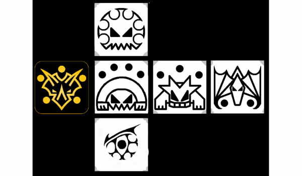
My view is that any design tweaks for this dice in particular need to be displayed alongside all of the other sides and they need to undisputibly (for game purposes) show the number they represent. and look cool.
I'm not married to this bloodshot snake eye either, but is it worth a redux? Can Pendrake's integrate a single pip?
No sharpey used here!

My view is that any design tweaks for this dice in particular need to be displayed alongside all of the other sides and they need to undisputibly (for game purposes) show the number they represent. and look cool.
I'm not married to this bloodshot snake eye either, but is it worth a redux? Can Pendrake's integrate a single pip?

