-
The forum software have been upgraded to the latest version.
If you notice anything that looks off, or does not work, please let us know.
For more information, click here.
You are using an out of date browser. It may not display this or other websites correctly.
You should upgrade or use an alternative browser.
You should upgrade or use an alternative browser.
Old Schooler New to Lizzies
- Thread starter T`hinker`er
- Start date
Salamander
Lord Tsunami
Member
- Messages
- 829
- Likes Received
- 29
- Trophy Points
- 18
T`hinker`er said:Thanks guys - the first one is painted and based. I'll take some proper photos over the weekend. I have to say, it looks pretty freakin' cool...the paintjob alone is going to do 2D6 impact hits
its Tuesday now and i want pics!!!
Salamander
T`hinker`er
Active Member
- Messages
- 825
- Likes Received
- 249
- Trophy Points
- 28
OK, OK! Sorry this took so long - work has been beyond crazy (let's hope that is a good sign for the economy as a whole!) So here's a photo of the first one, all painted up:
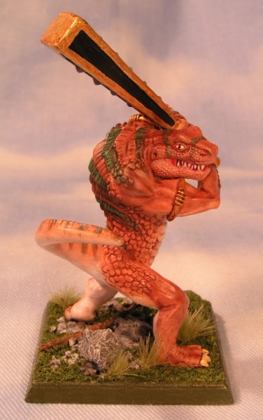
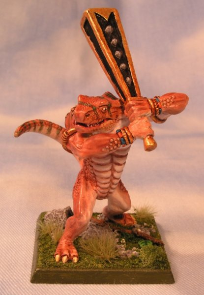
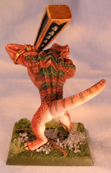
And here's one with the skinks, so you have an idea how my color schemes all work together:
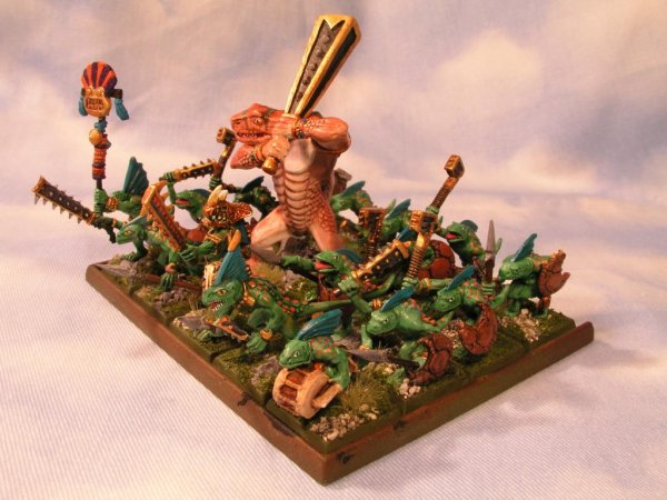
Please give me your feedback so I have something to read whenever I can break free to check back here again


And here's one with the skinks, so you have an idea how my color schemes all work together:

Please give me your feedback so I have something to read whenever I can break free to check back here again
Saurus
nathanbomb6
New Member
- Messages
- 51
- Likes Received
- 1
- Trophy Points
- 0
DAAAAM that's great.
and the colour scheme seems to work very well. it makes it very easy to focus my eyes on details and makes the other colours stand out even more
sticking around to see more! can't wait
and the colour scheme seems to work very well. it makes it very easy to focus my eyes on details and makes the other colours stand out even more
sticking around to see more! can't wait
Ripperdactyl
DanBot
Member
- Messages
- 424
- Likes Received
- 31
- Trophy Points
- 18
Awesome work! Can't wait to get my hands on them. Although mine wont come out nearly as well. The stripes seem really fitting. I may have to try that as well. The eyes and the blending, are really really good. Worth the wait. Looks like your best paint job yet. Good model to go all out on too.
Salamander
T`hinker`er
Active Member
- Messages
- 825
- Likes Received
- 249
- Trophy Points
- 28
Thanks for the comments guys!
Word came to me last night that these will be added to the Chapterhouse website NEXT WEEK as a new release!
Here is the other Croc:
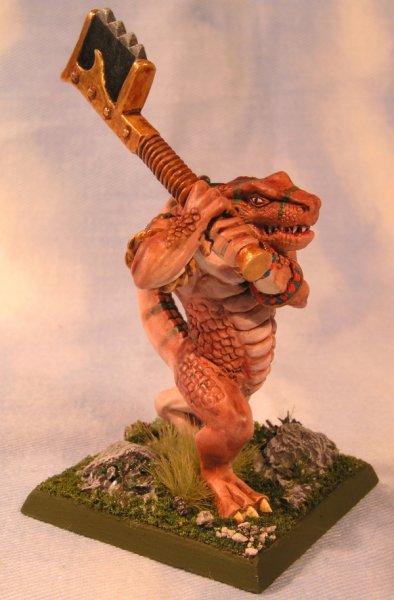
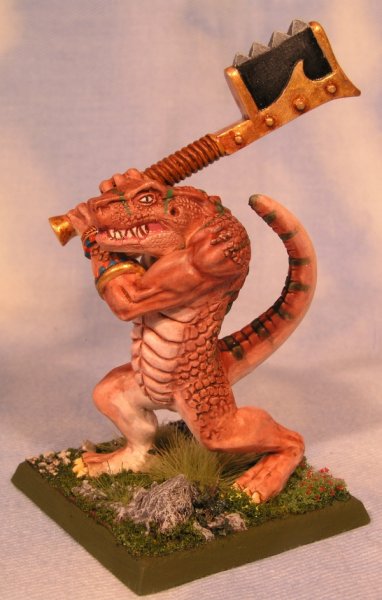
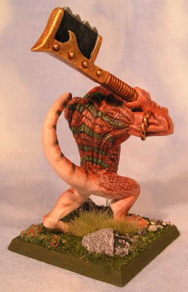
This is the one that my son contributed to, especially the sculpting of the feet and legs. He really liked the little berry bush I added to the base
Please give me your feedback so I have something to read when I can break free to check back here again! Until then, remember:
Never Smile at a Crocodile
No you can't get friendly
With a Crocodile
Don't be taken in
By his welcome grin
He's imagining how well you'd fit
Within his skin!
http://www.youtube.com/watch?v=RMaPTZdwjPE

Word came to me last night that these will be added to the Chapterhouse website NEXT WEEK as a new release!
Here is the other Croc:


This is the one that my son contributed to, especially the sculpting of the feet and legs. He really liked the little berry bush I added to the base
Please give me your feedback so I have something to read when I can break free to check back here again! Until then, remember:
Never Smile at a Crocodile
No you can't get friendly
With a Crocodile
Don't be taken in
By his welcome grin
He's imagining how well you'd fit
Within his skin!
http://www.youtube.com/watch?v=RMaPTZdwjPE
Slann
n810
First Spawning
- Messages
- 8,103
- Likes Received
- 6,527
- Trophy Points
- 113
-Lewis CarrollHow doth the little crocodile
Improve his shining tail,
And pour the waters of the Nile
On every golden scale!
How cheerfully he seems to grin,
How neatly spreads his claws,
And welcomes little fishes in
With gently smiling jaws!
PS. your Korx look great
Bastiladon
Old Mossy
Active Member
- Messages
- 772
- Likes Received
- 33
- Trophy Points
- 28
Very well painted, and loving the base! (especialy the berry bush  ) I LOVE the blending on the tail.
Looking back, I think one of your best decisions for this model was adding scale details to the face. It really brings it together.
I think I may have to find the money to get one for my mordheim warband.
Looking back, I think one of your best decisions for this model was adding scale details to the face. It really brings it together.
I think I may have to find the money to get one for my mordheim warband.
Salamander
Lord Tsunami
Member
- Messages
- 829
- Likes Received
- 29
- Trophy Points
- 18
really sweet paintjob (and sculpting ofc) on the body and skin! Lovely colors and well executed 
However, i do believe that the club on the first pic (and to a lesser extent the other weapon too) needs some more work. the gold is a bit bland and the black/silver(gray?) looks a bit rushed. The weapon is so huge that it draws attention, and i think it deserves something extra to come up to the standard of the rest of the model.
also the bases are AMAZING!
Wow, just wow, I've just spent the last few days working my way through this log, and you are a very talented individual! What you've achieved is simply inspiring, especially since I'm soon going to start my own Lizardmen army (as soon as the models are delivered!). I just wish I could buy a few of your Croxigators, but unfortunately the GW I play all my games in wouldn't allow them  , but they're amazing models (and I prefer them to the actual models by a pretty wide margin).
Anyway, that's all I have to say , keep up the amazing work man!
Anyway, that's all I have to say
Terradon
FavoredoftheOldOnes
Member
- Messages
- 545
- Likes Received
- 21
- Trophy Points
- 18
Man! Those new Krox of yours look great! Amazing paint job for an amazing sculpt. Well done my friend.
Salamander
T`hinker`er
Active Member
- Messages
- 825
- Likes Received
- 249
- Trophy Points
- 28
Hey thanks everyone! I'm about to have another week of long days and late nights at the office (the life of a litigator!) so I thought I'd check in here and write back before things get too crazy. Always so nice to read all your comments and you all inspire me as much as I hopefully inspire you 
n810 - One good quote deserves another and I love Lewis Carroll! Touche'
Old Mossy, thanks for the kind words. The blending was done by base-coating the miniatures in white and tan (raw umber) using an airbrush. I then went back over everything with a wet brush to fix any mistakes, and added successive washes with a mixture of burnt sienna and orange. The green lining worked out better than I'd hoped and I actually think I could have added more, but I was afraid to obscure the sculpting and facial expressions too much. Thanks to everyone who chimed in about adding the extra scale texture. I agree it was the right call, although at the time I was very nervous about it.
Lord Tsunami, I agree about the large black areas on the weapons, especially the club. The Axe actually looks o.k. to me. Not sure how I can fix this. I tried a grey drybrush but it didn't look right. The only thing that I think would make me happy is to do a marbleized look, or add layering, like obsidian. Not sure I am a good enough painter to pull this off, but if I work up the nerve I'll post some new photos.
Chunk, welcome to the list and thanks for reading all that! I know it's a lot to go over, but sometimes when I think about all the work I have ahead on this army and feel a bit discouraged, I browse through this plog and realize how far I've already come, and it pushes me to keep going. Pity about your local GW policies. I think that really stinks.
Favored, thanks man! Hope all is well with you and we get to actually play a game real soon!
Terradon
FavoredoftheOldOnes
Member
- Messages
- 545
- Likes Received
- 21
- Trophy Points
- 18
Yeah definitely. Send me a message on facebook sometime and we can arrange something. I work during the week but I have weekends off.
Salamander
T`hinker`er
Active Member
- Messages
- 825
- Likes Received
- 249
- Trophy Points
- 28
Will do!
Salamander
Lord Tsunami
Member
- Messages
- 829
- Likes Received
- 29
- Trophy Points
- 18
how about making the whole club in black marble? even the golden edges and the spikes. i can just imagine the skink artisans carefully crafting a marble pillar into a club and giving it to their dim relatives to wield in battle 
plus, it would probably look cool, and it would be easier to do a marble effect on a larger area.
plus, it would probably look cool, and it would be easier to do a marble effect on a larger area.
Salamander
T`hinker`er
Active Member
- Messages
- 825
- Likes Received
- 249
- Trophy Points
- 28
I might try this on another casting, just in case. Or perhaps I'll let you tackle that in the upcoming "Lustria's Best" painting competition 
Salamander
T`hinker`er
Active Member
- Messages
- 825
- Likes Received
- 249
- Trophy Points
- 28
Here is a photo that I took on the run this morning with my Droid camera-phone (not the best camera, sorry!) I wanted you guys to see my Crocs in a Skrox unit with one of GW's figures, for comparison. Personally, and YMMV, the more I look at this unit the more I want to sculpt a Croc champion of my own in place of the GW "Ancient", a figure that I never really liked at all and which led me to do my own sculpting in the first place. Nevertheless, in terms of scale and overall feel, I think the Crocs work pretty seamlessly together with the Krox, and since all of these are painted in the same color scheme, I think it makes comparison easier.
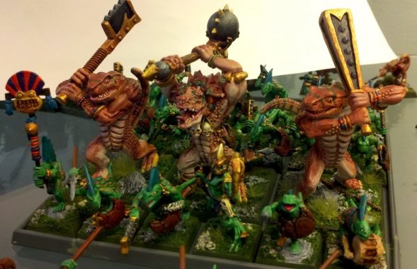
Please excuse the over-sized Skink Chief obscuring part of the GW figure - I should have swapped that figure out before taking this picture - it's a lovely figure, but stands more than a head taller than the tallest skink...nice going GW!
Again, opinions can differ, and tolerance is what makes the world go 'round. To me, the more variation, the better
Salamander
Lord Tsunami
Member
- Messages
- 829
- Likes Received
- 29
- Trophy Points
- 18
they sure look pretty damn good. lovely contrasting colors 
Terradon
FavoredoftheOldOnes
Member
- Messages
- 545
- Likes Received
- 21
- Trophy Points
- 18
Looks awesome man. Love the colors and the stripes and the armbands.
