So after reviewing the pictures above, I have been disappointed in them. All of them. At first, I thought it was due to insufficient lighting or my phone/tablet's camera quality, but it was more than that: the pictures show the models with approximately 2x zoom, and I have noticed missed spots, small errors, and poor detail/contrast in many areas. Combined with my waning hobby time and disinterest in AoS, I have decided to halt painting new models until I am satisfied with my current skill/techniques. As such, I have decided to work on the easiest model to touch-up: the Razordon.
Razordon Redux
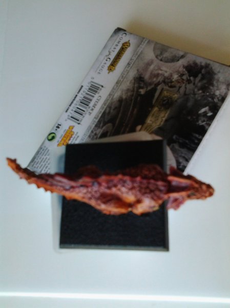
Before:
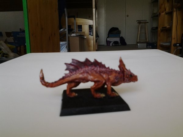
 After:


The difference is rather subtle, but I have added an extra layer of highlights to the spines, flesh, and tongue. In the before image, the Razordon's flesh was first primed black and then a layer of light beige (Ushabti Bone) was added. Highlights were then added using a similar color (Screaming Skull), but this provided little contrast as they are both light beige's. In frustration, I decided to apply a brown wash (Reikland Earthsade), and while this provided more contrast, it also gave the Razordon a very dark, burnt-flesh appearance that looked unnatural in all but the brightest of lighting. To remedy this issue, I decided to apply the following logic:
- The flesh was too brown and dark
- I needed to highlight to the underbelly to show raised surfaces and provide contrast with the brown
- I needed the highlight to contrast with the beige that I used previously
My solution was to mix the previous beige (Screaming Skull) with a flesh tone (P3's Ryn Flesh) in a 1:1 mixture, and this produced a color that still resembled flesh. A similar procedure was done for the tongue, and the result is shown above.


")