-
The forum software have been upgraded to the latest version.
If you notice anything that looks off, or does not work, please let us know.
For more information, click here.
You are using an out of date browser. It may not display this or other websites correctly.
You should upgrade or use an alternative browser.
You should upgrade or use an alternative browser.
Blog Aginor's Painting Blog
- Thread starter Aginor
- Start date
Slann
Aginor
Fifth Spawning
- Messages
- 12,256
- Likes Received
- 20,177
- Trophy Points
- 113
Thanks!Looks great! Really like how the gold and browns go with the purple
I knew the colors would harmonize well because I used them on the armor of my Vampire Lord (I posted some pictures a few pages back in this thread) and I was pretty surprised how well they worked back then.
Slann
NIGHTBRINGER
Second Spawning
- Messages
- 90,207
- Likes Received
- 277,921
- Trophy Points
- 113
Can't go wrong with purple. Very regal.
Looking good!
Looking good!
Terradon
HeirofCarnage
Well-Known Member
- Messages
- 529
- Likes Received
- 956
- Trophy Points
- 93
I am pissed that I can't like those bastilidon pictures twice!

Terradon
HeirofCarnage
Well-Known Member
- Messages
- 529
- Likes Received
- 956
- Trophy Points
- 93
He looks psychedelic! 
Scar-Veteran
tom ndege
Well-Known Member
- Messages
- 2,568
- Likes Received
- 5,173
- Trophy Points
- 113
Love the tail... the pattern looks great on the main scales shell but a bit weird on the spiky scales on the edge of the shell... shout have done the a bit more out of shape like you did on the tail...
But it still looks great!
But it still looks great!
Slann
Aginor
Fifth Spawning
- Messages
- 12,256
- Likes Received
- 20,177
- Trophy Points
- 113
That's my main gripe about it as well but the other shapes I tried actually looked worse.Love the tail... the pattern looks great on the main scales shell but a bit weird on the spiky scales on the edge of the shell... shout have done the a bit more out of shape like you did on the tail...
But it still looks great!
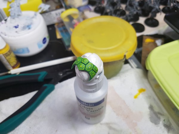
The other point is the tail which has thicker lines than the other scales, but it looked strange with those thin lines I originally had on it.
Terradon
HeirofCarnage
Well-Known Member
- Messages
- 529
- Likes Received
- 956
- Trophy Points
- 93
It looks fine to me. I have no criticism to offer.
What are those paints in the background?
What are those paints in the background?
Slann
Aginor
Fifth Spawning
- Messages
- 12,256
- Likes Received
- 20,177
- Trophy Points
- 113
Most of it are Army Painter paints. But I also have a few GW paints.
The GW paints are thicker and I hate those damn pots. But they cover rally well which is why I like them for drybrushing and some other things. But I mostly bought them because back then there were some tones not available by Army Painter yet. For example the green I used for the lines on the Basti. Now Army Painter has an equivalent but back then only Vallejo and GW had such bright greens.
The GW paints are thicker and I hate those damn pots. But they cover rally well which is why I like them for drybrushing and some other things. But I mostly bought them because back then there were some tones not available by Army Painter yet. For example the green I used for the lines on the Basti. Now Army Painter has an equivalent but back then only Vallejo and GW had such bright greens.
Terradon
HeirofCarnage
Well-Known Member
- Messages
- 529
- Likes Received
- 956
- Trophy Points
- 93
Are army painter paints on par with GW paints?
Slann
Aginor
Fifth Spawning
- Messages
- 12,256
- Likes Received
- 20,177
- Trophy Points
- 113
Some people say worse, some say equal or better. I think it boils down to personal preference.
I say they are about as good. They handle a bit differently though. I like that they are thinner so they don't clog up details and you dont have to thin them as much so you don't make errors while thinning them.
But you have to build up your layers more slowly since not all of them (especially the bright colors) cover that well. You cannot paint yellow over black for example.
I also like those dropper bottles. Much better than the GW pots. Vallejo uses those as well.
Terradon
HeirofCarnage
Well-Known Member
- Messages
- 529
- Likes Received
- 956
- Trophy Points
- 93
Thanks.
I am going to have to consider buying some high quality paint (jeez you guys must be made of money!).
I am going to have to consider buying some high quality paint (jeez you guys must be made of money!).
Slann
Aginor
Fifth Spawning
- Messages
- 12,256
- Likes Received
- 20,177
- Trophy Points
- 113
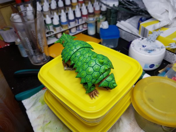
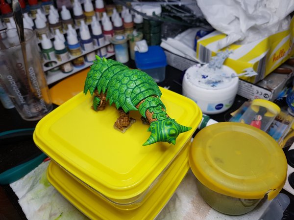
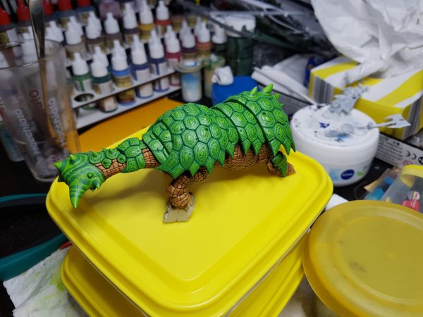
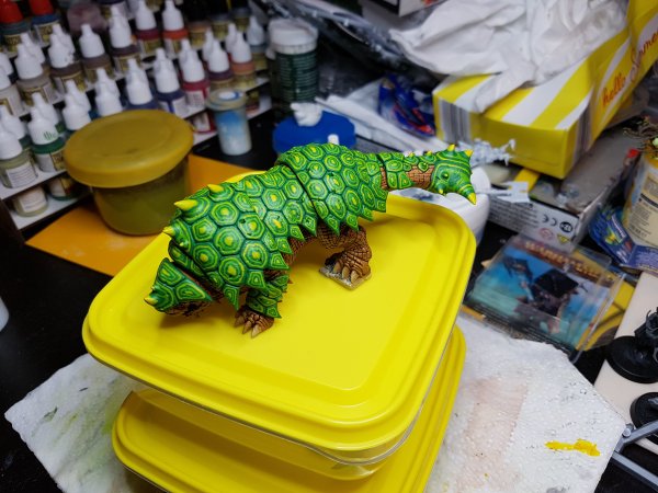
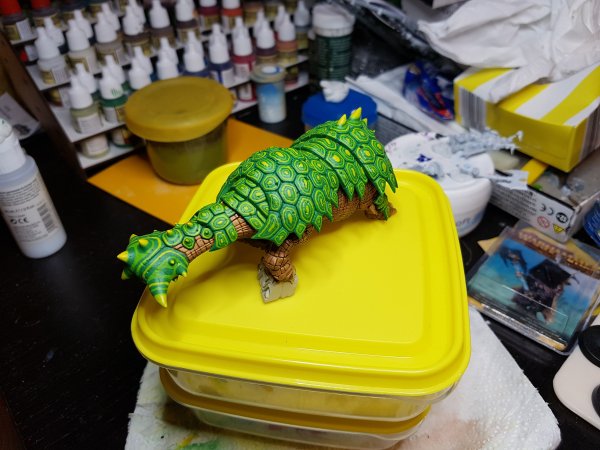
Another WIP.
Some corrections still necessary, and then shading.
Now a question for our expert painters like @Crowsfoot, @neveroddoreven, @Xlanax_lot and others since I fear I might yet ruin it:
Should I - thinly - shade the whole shell green and then the crevices a bit deeper, or should I shade only the crevices?
I tend to do the first to bring all the paints together a bit more. In a pinch I can still redo some of the yellow highlights.
So what are your opinions on that?


Saurus
Teheloqtec
Active Member
- Messages
- 61
- Likes Received
- 164
- Trophy Points
- 33
Outstanding! Great job making it look natural. Are you planning on glazing or applying a wash to unify the tones of are you going to keep the high contrast? Would look great either way, but unifying the tones with a brown wash would look the most organic. Keep up the good work!
Carnasaur
Itepixcauh
Stranded Ghekkotah
- Messages
- 1,038
- Likes Received
- 3,040
- Trophy Points
- 113
I would do an Athonian Camoshade wash all over. So dark camo green, but that's my opinion.
Slann
Aginor
Fifth Spawning
- Messages
- 12,256
- Likes Received
- 20,177
- Trophy Points
- 113
I have a very similar shade, green tone by Army Painter. It is just a tiny bit darker. That's what I was planning to use. It looks OK on my other Basti and it did look OK on my test piece as well (posted a few pages back).I would do an Athonian Camoshade wash all over. So dark camo green, but that's my opinion.

