Hi
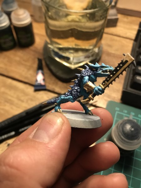
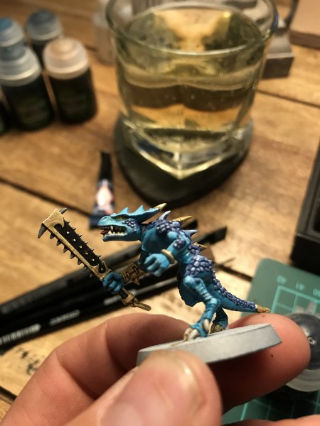
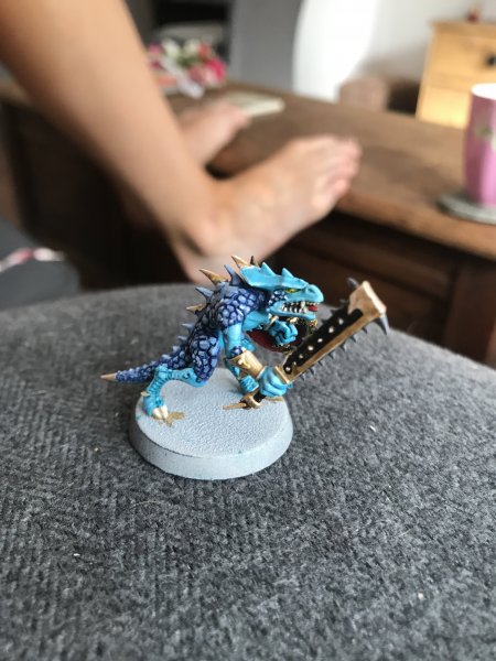
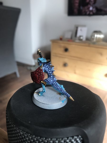
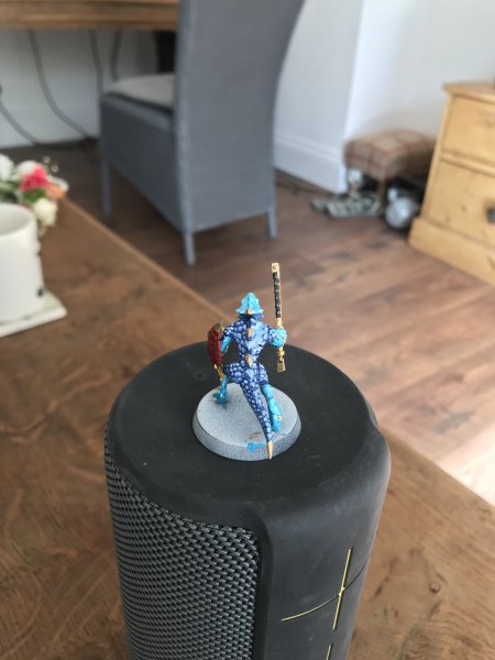
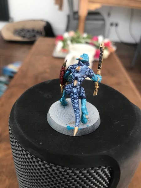
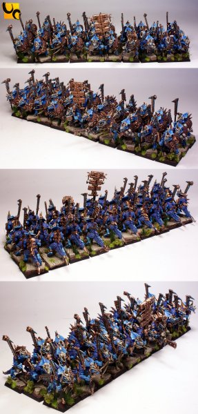
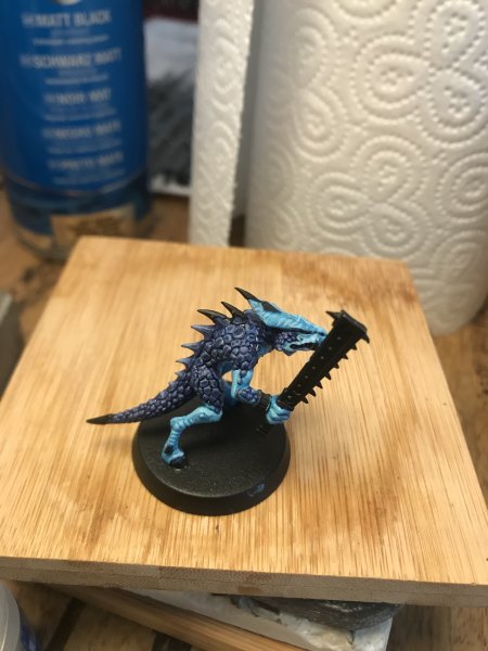
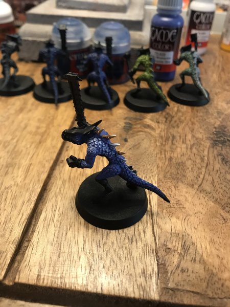
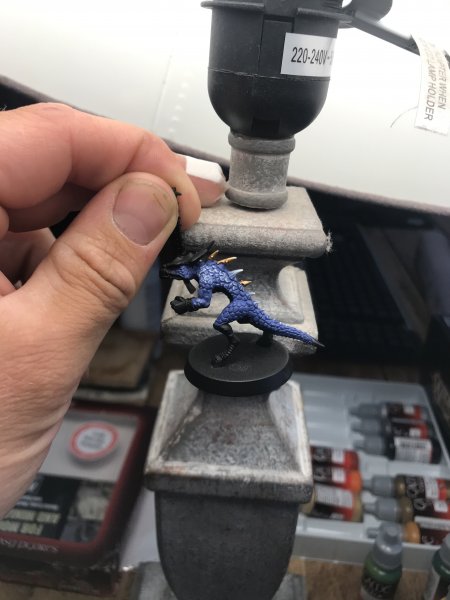
@Greenj92, I was just quickly replying earlier when I said the photo could have been color corrected. I'm sorry I wasn't more helpful with suggestions. Part of what I was saying is that you might be closer than you think. But paint the colors you like. If you want to work on it more, keep testing.
I'm sure
@Erta Wanderer is on the right track with Kantor with Teclis highlights. The base color could possibly be Maccrage Blue as well. It might be helpful to download the Citadel Paint app to your phone/tablet to see what color combos GW already recommends.
One suggestion I think I can make is that if you want brighter colors overall try using more "pure" colors, with less white. Basically, what I mean is if you want deep blue scales with a lighter blue highlight or edge, then go the route of two separate blues (like kantor & teclis), not just the base color with white added. It's not bad to do it that way, but adding more and more white doesn't necessarily make a color look brighter, it often just makes the color appear more "chalky".

")
")